ArchBook: Architectures of the Book
Published July 13, 2013
Corrected and updated October 19, 2021
Introducing text from the earliest days to present, decorated letters are inseparable from the history of the book. Found at the beginnings of sentences, paragraphs, sections, and chapters, these letters mark and draw attention to these openings of the text, providing navigational aids for readers.1 Often the drawings in and around the letter relate to the text, illustrating its meaning and adding to the reader’s understanding of the text, but the illustrations may also have nothing to do with the text at all, serving a stylistic function instead.
There has been a lack of consensus among scholars as to what these letters should in fact be called. They have been referred to as historiated initials, illuminated letters, decorated initials, ornamental initials, decorated letters, illustrated initials, or illustrated capital initials. There is some distinction to be found among these labels, especially with respect to historiated initials, which are a visualization of some part of the text, and are not purely decorative.2 However, the terms are also sometimes used interchangeably, or different scholars may refer to the same sorts of examples with different terminology. Decorated letter3 provides an inclusive and appropriate term, one that encompasses boxed letters, letters with narrative elements, letters that trail down the margins, hugely ornate letters that almost fill the page and are fully illuminated Illuminated a manuscript or early printed book where the margins or initial letters are decorated with flowers or other designs See: Historiated CLOSE or ESC, and quite modest letters that have simple decorative elements and are not much larger than the surrounding text. Decorated letters provide important visual cues to readers, from dividing text in a purely functional manner, to hinting at the content of the text, and informing on its history from the stylistic devices employed. Because of their importance to the reading of text, decorated letters ought to be considered for integration into digital reading interfaces. Not to do so is textual alteration, providing a distinctly modified reading experience and a clear loss of content.
The history of decorated letters is linked to the monastic copying of religious scrolls, but it was cemented by the inauguration of the codex between the 2nd and 4th centuries CE, when the page was invented as the visual unit of text.4 Originally functioning “to attract attention and afford pleasure to the eye” while “marking articulations in the text,”5 these early applications of graphic design soon took on the task of communicating broader social, cultural, economic and political messages. To do so they utilized a visual lexicon that spanned cultures, geographic locales, spiritual traditions and artistic movements. Thus they are complex mirrors of the culture that produced the text they inhabit.
In tracing their history, one is confronted immediately with inventiveness and originality of design, even within the same manuscript, where inexhaustible variations and diversity are the norm, especially in the high Middle Ages.6 Despite their diversity, it is possible to trace broad trends across historical epochs. They were, at different times, influenced by Roman (the squared letter), Celtic (scrollwork motifs from the Book of Kells), scriptural, classical, and mythical symbolism, and reached the height of opulence in the 7th to 12th centuries.7 They adhered to scriptural dictates while smuggling in classical references that hinted at the Renaissance to come.
Figure 1
Click For Larger Image
The Cathach / The Psalter of St. Columba Decorated letter, early 6th century. Image courtesy of Royal Irish Academy.CLOSE or ESC
At first, texts such as the 4th-century Augusteus by Virgil had letters embellished only with “filling ornament” — the addition of animal or plant designs to the letter while still respecting its form.8 One such example from the Cathach or Psalter of St. Columba is shown in Figure 1. The principle of metamorphosis is illustrated here, with one form changing into another as the tail of the letter turns into a fish with a cross above it.9
It was not long before an eruption of creative visual innovation occurred, especially in Ireland and places Irish monks had settled, such as at Lindisfarne Abbey in northern England. By the late 7th century the richest, most complex examples of decorated letters were being produced, notably in The Book of Durrow (late 600s) and The Book of Kells (circa 800 CE).10
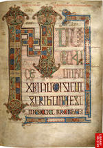
In approximately the 8th century, for the first time letters were used as frames or containers for images, and the true historiated initial with narrative content emerged. Historiated initials directly reference the text, and continued to be used throughout the Middle Ages and beyond, becoming emblematic of decorated letters. The Vespasian Psalter is an 8th-century example, and Fig. 2 shows Psalm 27 on the right and the initial D with an image of David with Jonathan, thought to be the earliest surviving English example of an initial with a narrative biblical scene.11
Figure 2
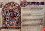
Click For Larger Image
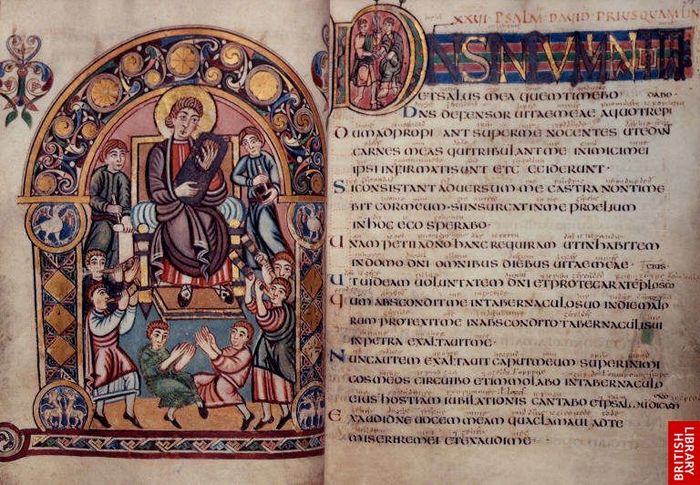
The Vespasian Psalter Made in eighth-century Kent, with pictures of King David. Image courtesy of (c) The British Library Board: Cotton Vespasian A I, ff.30v-31.CLOSE or ESC
Two prominent trends typify decorated letters of the medieval period. The first is the Insular tradition that emerged from the British Isles in the early medieval period with designs of densely decorated pages, full of intricate interlace and scrollwork, themes involving metamorphosis, a rich and varied colour palette, and a seemingly deliberate attempt to obliterate the letters, rendering them almost completely illegible. Second is a classical style that features traditional Roman script, modest use of colour, restrained ornamentation, a clear sense of order to the page, and designs that leave individual letters disconnected and fully legible. Decorated letters move back and forth along a continuum between these two styles and beyond, signalling when the social, political and cultural climate was shifting, for example towards the classics during the Renaissance.
Figure 3

Click For Larger Image
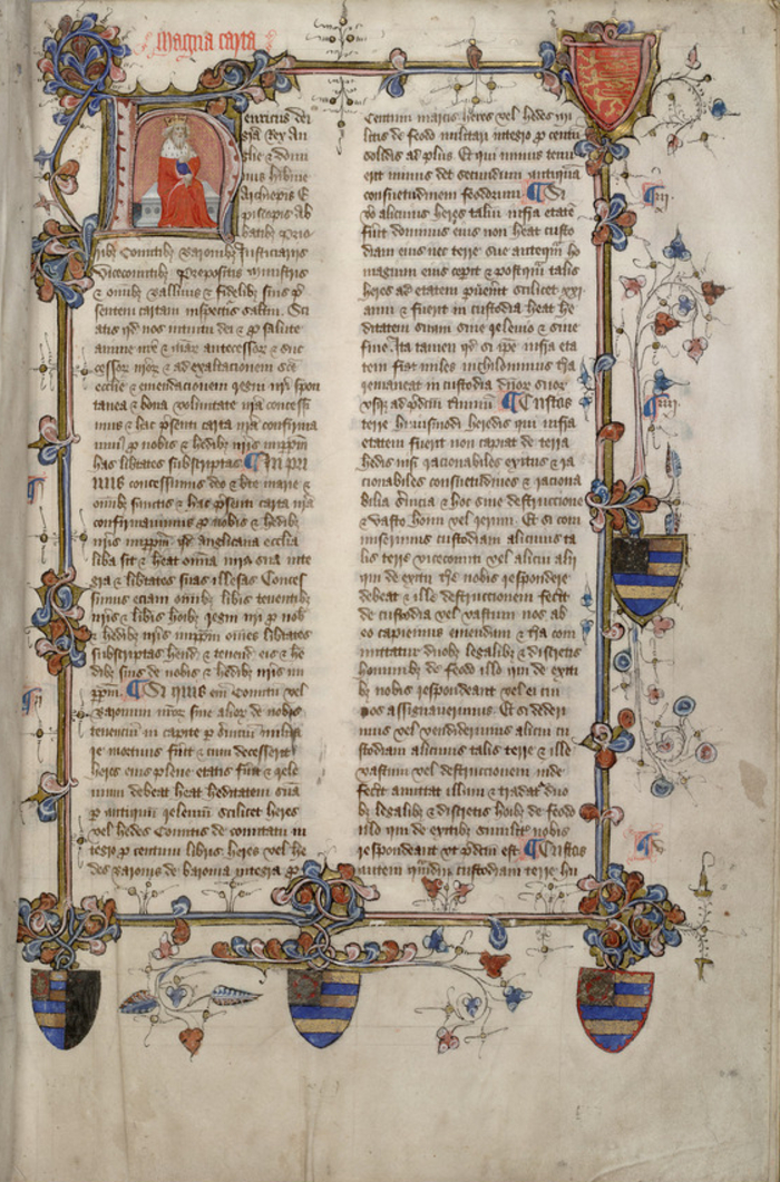
Magna Carta With historiated initial showing Henry III, from a 15th-century statute book. Huntington Library MS HM 19920. See the Huntington catalogue entry or Digital Scriptorium for more detail about the manuscript. Image courtesy of The Huntington Library, San Marino, CA.CLOSE or ESC
Decorated letters can be useful in tracing other shifts. In the 12th century Corbie Florus the artist depicts himself in one of the historiated initials, and it is apparent that he is a lay professional rather than a monastic scribe. Thus this letter captures an early instance of the separation of maker and user that would lead to the rise of specialist craftsmen.12 Similarly, a manuscript of the Magna Carta reissue of 1225 (Fig. 3), from a 15th century statute book, reflects a gradual shift in the power dynamics of medieval England. King Henry III is depicted on the page within the decorated letter 'h' that begins his name. This emphasis on royalty reflects the Magna Carta's role as a secular legal document, as Henry and his immediate predecessors sought to establish a stable power-sharing relationship with the restless English feudal barons.13 While the church is also given rights in the document, the decorated initial clearly places the emphasis on secular royal authority.
From the turn of the fifteenth century, the approximate end of the infancy of the moveable-type printing press in Europe, the fate of the decorated letter was closely tied to changes in social, economic, and aesthetic environments. Trends in printing techniques and styles often reached England years after France and Italy had adopted them. Nonetheless, even though the manner of representing them may have changed, decorated letters continued to serve the meaning-making purposes they had in manuscripts and early printed works. The ability to access the details and stories these initials contain adds enormously to scholars’ understanding of the lives, times, and circumstances of those for whom the letters were decorated.
Figure 4
Click For Larger Image
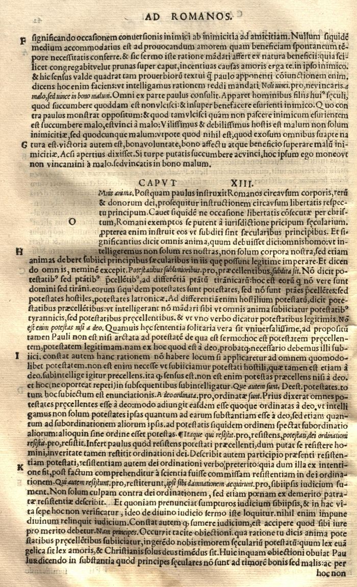
Unrealized Initial From Epistolae Pauli et aliorum Apostolorum ad græcam veritatem castigate. Image courtesy of Thomas Fisher Rare Book Library, University of Toronto.CLOSE or ESC
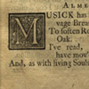
With the advent of printing, illumination was no longer used as a matter of course.14 However, early printers did try to make their books look as much like the manuscripts they were reproducing as possible.15 This often involved leaving blank spaces in the printed text for an illuminator to hand-draw decorated letters (Fig. 4). Eventually, large-scale letters became available in type and the more easily duplicated wood or metal engravings supplanted the hand-drawn initials.16
Figure 5
Click For Larger Image
Champ Fleury Geofroy Tory’s illustrated alphabet. Image courtesy of Thomas Fisher Rare Book Library, University of Toronto.CLOSE or ESC
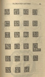
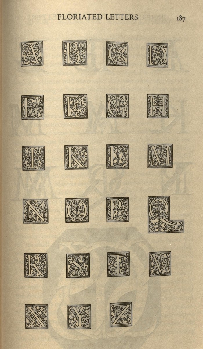
In the early sixteenth century, the decorated letter found a champion in Geofroy Tory, a Paris bookseller and printer who appreciated the symbiosis of text and decoration.17 Tory’s objective was to show the life inherent in letters by structuring Roman capitals in accordance with the proportions of the human body.18 His book, Champ Fleury, details his arguments, provides supporting diagrams and a sample set of floriated letters (Fig. 5). Pattern books such as this, containing designs for decorated letters with complete or partial alphabets, have in fact existed since the later Middle Ages.19
Figure 6

Click For Larger Image
Historiated Letter First page of the Book of Genesis, 1701. Image courtesy of Thomas Fisher Rare Book Library, University of Toronto.CLOSE or ESC
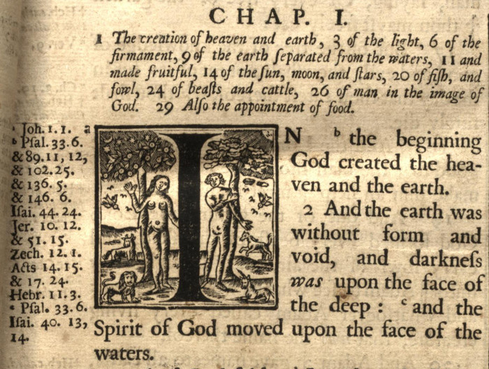
During the 1500s and the 1600s in England, religious inclination affected the degree of decoration of Bibles. Catholics felt images in the text led to an “apprehension of the divine,” linking the words with understanding, but the more puritanical felt images denied the truth of the word of God, and preferred less ornate editions.20 Figure 6 is an example of a less ornate, but very descriptive, historiated letter from a 1701 edition of the Bible. The symbolism of the illustration is apparent, with Adam’s side of the frame sunlit and Eve in the darkness except for the moonlight.
Decorated letters also made feisty challenges to received orthodoxy of the day, as is exemplified by Vesalius’ illustrations of the vagaries of procuring bodies for dissection in the 16th century.21 Social and aesthetic attitudes can be identified and examined from the vantage point of the decorated letter.22 Some American Protestant clergy were appalled when Harper’s Illuminated Bible was published in the United States in 1846, because it depicted Adam and Eve nude in the first initial of Genesis, and some naked angels were stationed at the beginning of Matthew’s Gospel.23
Historiated decorated letters can be said to serve a functional purpose, beyond style. Such letters typically depict an image from the section which they open, hinting to the reader of what is to come, as well as providing a visual cue to the reader as to the author’s intended presentation of the material. In this way, texts of the late medieval period remind us of the lessening dependence on religious icons and of the rise of secularism. In contrast to earlier religious texts, it is in this period that other figures begin to stand in for the familiar religious icons.
Figure 7

Click For Larger Image
Letter “L” Depicting a body snatching exploit, by Andreas Vesalius (1543). Image courtesy of Thomas Fisher Rare Book Library, University of Toronto.CLOSE or ESC
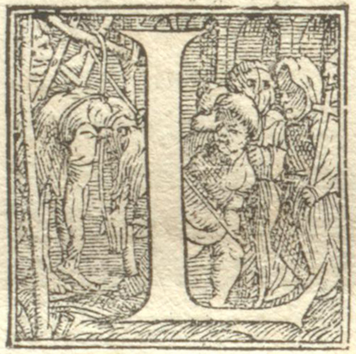
Scholars have also delighted over the anatomical books published by Andreas Vesalius in Switzerland and William Cowper in Britain, in the 16th and 18th centuries respectively, each detailed with historiated initials depicting the vagaries of procuring bodies for dissection as well as particular musculature or other anatomical illustrations. These illustrations serve the added function of informing readers in referencing the subject matter of the text, or telling an anatomical, surgical, or medical story that additionally captures the attention and imagination of the reader.24 Vesalius published his De humani corporis fabrica in 1543, although the illustrator of the Fabrica is not known.25 At the time at which Vesalius wrote, dissection was seen the barbaric domain of surgeons, who had access to a limited official supply of bodies. The initials of the Fabrica call attention to these facts, with a body being taken from the gallows, as seen in Fig. 7, as well as one being carried out on a stretcher (possibly indicating a body snatching exploit), and a severed head being handed down by the headsman and its subsequent dissection. It is entirely possible that Vesalius intended his anatomical volume to call attention to the difficulties in encountered by the anatomist in obtaining bodies, and plead for a greater official supply.26
Nearly two centuries later, William Cowper’s Myotomia Reformata (1724) appeared. This volume was renowned for its many illustrations of human musculature and bones. Unlike Vesalius’ initials, which tell a story beyond anatomical description, Cowper’s initials tend to focus on the anatomy described. Some of this is wildly entertaining, as is the case with the letter “V”, in which depicts a figure “mooning” the reader and opens a discussion of the muscles of the anus. The initial “G”, meanwhile opens the chapter on the “muscles of the bladder of urine” and depicts an écorché holding a urinary bladder.27 These initials seemingly serve not to inform the student on anatomical particulars, but to engage the imagination and interest of the reader.
Figure 8
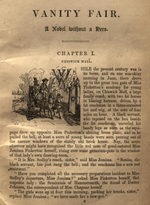
Click For Larger Image

Introductory decorated initialVanity Fair by William Makepiece Thackeray (1848). Image courtesy of Thomas Fisher Rare Book Library.CLOSE or ESC
Historiated initials can also be said to frame an author’s intended imagery in visual as well as textual terms. This may particularly be the case when author and illustrator are one and the same, as with William Makepiece Thackeray’s Vanity Fair, first published in 1848. Thackeray illustrated the book himself, and created a historiated letter for each chapter. The letters, each depicting a scene, exist in the first edition of the book but were omitted from most subsequent editions. Although John Carey, in his introduction to the Penguin Classics 2002 edition of the book, regards the illustrations as poor,28 it has also been insisted that the sketch-like quality of Thackeray’s initials comprises their beauty, as they provide quick views, catching the actors at representative moments, rather than depicting a detailed scene.29 This can be observed in Fig. 8, which opens the first chapter of the book and depicts the Sedley family coach arriving at Miss Pinkerton’s Academy for Young Ladies to collect Amelia Sedley and her friend Becky Sharp. The initials provide us with a view into Thackeray’s attempt to reconcile his “two ways of seeing” — in visual form as well as words.30 In employing this device, Thackeray was thus able to present a clear vision of his characters, leaving less opportunity for individual variation.
Decorated letters also function as stylistic devices, offering not only commentary on the text, such as is the case with historiated letters, but may also enhance the material richness of the text, and situate the text within the broader cultural and artistic landscape. Decorated letters as stylistic devices exist in very early texts, as well as in the modern. Moving beyond narrative representation, these decorated letters signify the place of the text within its greater landscape.
Figure 9
Click For Larger Image
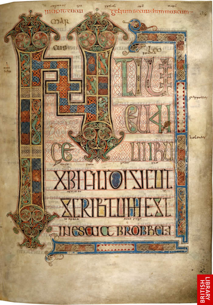
Incipit page Gospel of St. Mark, Lindisfarne Gospels. Image courtesy of (c) The British Library Board: Lindisfarne Gospels, Cotton Nero D. IV, f.95.CLOSE or ESC
The Lindisfarne Gospels (Fig. 9) was produced in the late 7th or early 8th century by a single monk living in Lindisfarne, England. The manuscript is greatly ornamented and rich in colour. At the opening page of each gospel is a painting of the gospel’s Evangelist, followed by a patterned carpet page. Then is a major initial page for each gospel, in which the first letters of the gospels are “greatly elaborated with interlacing and spiral patterns strongly influenced by Anglo-Saxon jewellery and enamel work.”31 Fig. 9 shows the ornate initial page of Gospel of St Matthew the Evangelist, illuminated in brilliant colour. A great range of colour is found in the illuminated pages of this manuscript, and sources include red and white lead, verdigris, yellow ochre, yellow arsenic sulphide, gall, indigo, folium, blue lapis lazuli, and a small amount of gold. These sources tell us a great deal about the lengths that the scribe and illustrator Eadfrith went to in creating the manuscript; at the time, the blue lapis lazuli could be found only in the foothills of the Himalayas, and it would have taken significant effort and time to reach Eadfrith in his monastery in Northumbria.32
Two principles characterize initials produced in the British Isles during the 7th and 8th centuries. First is the principle of metamorphosis, in which forms merge into one another, and the second is the accompaniment of initials by other large letters that bridge the initial and main text script by gradually decreasing in size.33 Both characteristics are found in the Lindisfarne Gospels, and can be seen in the incipit page of St. Mark’s Gospel (Fig. 9). The design blends elements of “Celtic, Pictish, Germanic, Anglo-Saxon and Mediterranean art (including Roman, Italo-Byzantine, Byzantine, Syriac, Armenian, and Coptic traditions).”34 Patterns and motifs from all these traditions combine in a complex web that is meant to convey the mystery of the Divine, and call to mind the difficulty of the hermeneutical task of decipherment. The rich materials and elaborate decoration of the Lindisfarne Gospels mark the manuscript as a ceremonial text, and the decorated initials are of utmost importance here, opening each gospel with vibrant colour and intricate pattern, all intended to highlight the splendour of the text.
Figure 10

Click For Larger Image
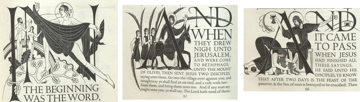
Three historiated initials by Eric Gill From the Golden Cockerel Press Four Gospels (1931). Image courtesy of Thomas Fisher Rare Book Library, University of Toronto.CLOSE or ESC
While a range of artistic influence may be found in the Lindisfarne Gospels, other texts are designed in more specific fashion. A 1931 edition of The Four Gospels of our Lord Jesus Christ: According to the Authorized Version of King James 1 from the Golden Cockerel Press features decorated letters by Eric Gill in an Arts and Crafts aesthetic. In The Four Gospels Gill decorated each letter in modern and remarkably sexual form. Fig. 10 shows three such examples by this key figure of the Arts and Crafts movement of the early 20th century. The Four Gospels was illustrated with sixty-four woodcuts, woven into the text, the type of which Gill also designed, thereby exerting full control over the layout of the book. This sort of overarching management of the book design conforms to the ideals of Arts and Crafts, whereby artists undertook or were intimately involved with all aspects of production.
For the past five hundred years, illuminated letters have survived the vagaries of the printing press and a fickle public. While the details of the challenges may be different from those of 1501, the concern to maintain beautiful, thought-provoking and animating decorated letters to guide and illuminate the way of readers of the future remains. They have inspired faith and distracted people from their faith. They have been created laboriously or have been shoddily crowded into texts. While often restyled to suit the conventions of the day, these letters have remained integral, and sometimes entertaining, visual cues that do not just enhance our reading of texts, but are vital to our whole understanding of the works they decorate.
Here we have trumpeted the importance of decorated letters throughout the history of the book. It seems natural, and obvious, that we should likewise do the same as we consider the move to digital reading interfaces. This may seem a desperate plea, given that e-reader interfaces allow the user to manipulate and change the display of text to a considerable degree. Yet it seems that the desire to maintain these artifacts persists among designers in the digital environment. Today, web pages are often the communication tool of choice, and web designers frequently use Cascading Style Sheets (CSS) to apply visual styles to their websites. Decorated letters can be found as part of this endeavour, and designers have created code for the implementation of dropped initials.35 A work-around of sorts, this activity is reminiscent of the early days of print, when books were printed with space for the initials to be hand-drawn in.
Perhaps these letters persist because, in some sense, decorated letters have always been interactive in a way that we associate with the digital age. Visualizations, of all kinds, are ways of representing information that extend beyond the textual. In this sense, we might understand the richness of a decorated letter in a medieval manuscript on the same lines as a visualization of a social network, relaying varying degrees of connectedness and also situationality. In essence, decorated letters function as a pre-digital way for the text to play with and interact with the reader on several levels at once, through the distillation and superimposition of several layers of meaning.
Like modern visualizations, these layered, textured and nuanced illustrations increase the ambiguity surrounding interpretation of the text. They can be read for meanings, and sometimes even constitute a commentary on the text, or bring to light socio-political undercurrents operating at the time. The first folio edition of the King James Bible in 1611, for example, contained not only floriated and biblical historiated letters, but a number of decorated letters containing mythological figures, such as Pan, Neptune and Daphne, which were unrelated to the text, or perhaps related in an oppositional sense.36 Norton opines that such images were not endorsed by the translators of this version of the Bible and that the printer acted on his own in incorporating those images.37
The types of information contained in decorated letters span many disciplines: typography; graphic design; history; religious studies; and the arts. They contain symbolism drawn from allegory, myth, scripture, and the classics; ethnographic details of everyday life; and social commentary on issues of the day. It’s difficult to envision that they would simply pass out of favour easily.
Alexander, Jonathan James Graham. The Decorated Letter. London: Thames and Hudson, 1978.
Backhouse, Janet. The Lindisfarne Gospels. Oxford: Phaidon Press, 1981.
Bartram, Alan. Five Hundred Years of Book Design. New Haven, CT: Yale University Press, 2001.
Beal, Peter. A Dictionary of English Manuscript Terminology: 1450 to 2000. Oxford: Oxford University Press, 2008.
Bettley, James, ed. The Art of the Book: From Medieval Manuscript to Graphic Novel. London: V & A Publications, 2001.
Bringhurst, Robert. The Elements of Typographic Style, version 3.1. Point Roberts, WA: Hartley & Marks, 2005.
British Library. "Lindisfarne Gospels." Sacred Texts. Accessed October 4, 2021. http://vll-minos.bl.uk/onlinegallery/sacredtexts/lindisfarne.html.
Brown, Michelle P. The Lindisfarne Gospels: Society, Spirituality and the Scribe. Toronto: University of Toronto Press, 2003.
Canham, Stephen. "Art and the Illustrations of Vanity Fair and The Newcomes." Modern Language Quarterly 43 (1982): 43-66.
Carey, John. Introduction to Vanity Fair, by William Makepeace Thackeray, ix-xxxii. London: Penguin, 2002.
Coss, Peter. The Origins of the English Gentry. Cambridge: Cambridge University Press, 2005.
Coyier, Chris. "Drop Caps." CSS-Tricks. Updated July 22, 2020. https://css-tricks.com/snippets/css/drop-caps/.
Eisenstein, Elizabeth. The Printing Press as an Agent of Change. 2 vols. Cambridge: Cambridge University Press, 1982.
Gutjahr, Paul C. "The Letter(s) of the Law: Four Centuries of Typography in the King James Bible." In Illuminating Letters: Typography and Literary Interpretation, edited by Paul C. Gutjahr and Megan L. Benton, 17-44. Amherst: University of Massachusetts Press, 2001.
Jessop, Martyn. "Digital Visualization as a Scholarly Activity." Literary and Linguistic Computing 23, no. 3 (2008): 281-93.
Jubert, Roxanne. Typography and Graphic Design: From Antiquity to the Present. Translated by D. Radzinowicz and D. Dusinberre. Paris: Flammarion, 2006.
Kendrick, Laura. Animating the Letter: The Figurative Embodiment of Writing From Late Antiquity to the Renaissance. Columbus: Ohio State University Press, 1999.
McKenzie, D. F. "Typography and Meaning: The Case of William Congreve." In Making Meaning: "Printers of the Mind" and Other Essays, edited by Peter D. M. McDonald and Michael F. Suarez, 198-236. Amherst: University of Massachusetts Press, 2002.
Meehan, Bernard. The Book of Kells. London: Thames and Hudson, 1994.
Norton, David. A Textual History of the King James Bible. Cambridge: Cambridge University Press, 2005.
Sanders, Mark A. "William Cowper and His Decorated Copperplate Initials." The Anatomical Record, 282B (2005): 5-12.
Wells, L. H. "Note on a Historiated Initial Letter in the Fabrica of Vesalius." Medical History, 6 (1962): 287-288.
 Supported by the University of Saskatchewan Humanities and Fine Arts Digital Research Centre. Initially created with the support of the Social Sciences and Humanities Research Council of Canada. Licensed under a Creative Commons Attribution-Noncommercial-No Derivative Works 3.0 License