ArchBook: Architectures of the Book
Published 3 January 2012
Corrected and updated 5 February 2022
The pages may be what we read in any codex Codex a book format made of stacked leaves that are attached together along one edge. See: Binding Edge Format Leaf CLOSE or ESC book, but what we see is the opening. Also known as a page spread Page Spread the two pages in the middle of a gathering where the verso and recto form a single conjugate leaf. Also known as a 'spread.' See: Opening Centre Spread CLOSE or ESC, an opening is the visual unit formed by facing verso Verso the page on the back of a leaf. Generally the page on the left of a book opening. See: Leaf Recto Page CLOSE or ESC and recto Recto the page on the front of a leaf. Generally the page on the right of a book opening. See: Leaf Page Verso CLOSE or ESC pages in a codex, including the gutter Gutter The inner margins of a page opening (the right margin of the verso page and the left margin of the recto page) and the valley where they meet or are bound together. See: Back Margins CLOSE or ESC where they join in the middle. An opening is primarily a visual unit rather than a bibliographical one, though it is possible for two conjugate leaves to form a single opening. (In magazine publishing, this point in a volume is known as the centre spread Centre Spread the two pages in the middle of a gathering where the verso and recto form a single conjugate leaf and thus can be printed as a single image. Most commonly used as such in magazine printing. Also known as a 'spread.' See: Opening Page Spread CLOSE or ESC.) As a visual unit, the opening is one of the defining features of the codex form, and one that persists through the eras of the manuscript, hand-press, and machine-press book. The opening is also a textual feature that bound books share with newspapers, magazines, pamphlets, maps, and some forms of ephemera Ephemera broadsides, pamphlets, advertisements and other forms of printing considered more disposable than books. See: Broadside CLOSE or ESC.
Bibliographically, the opening in a codex book is the result of the imposition, folding, and binding of gatherings Gathering the group of leaves created when a single sheet is folded, or when multiple sheets are nested or 'quired' together (as, for example, in the format "folio in 6s" which is created by quiring three folia). See: Signature Format CLOSE or ESC (or quires) of printed sheets, sometimes in very complex configurations. The majority of openings in any given book do not show pages that were printed side-by-side on the sheets that came off the press; rather, pages usually appear next to each other, in their proper sequence, only after the sheet is folded. A printer’s-eye-view of a book as it takes shape on the press is radically different from that of its readers. In other words, the opening is a visual effect achieved only through a complex process that happens during a book’s manufacturing—an example of bibliographical complexity working (mostly unnoticed) in the service of readers.
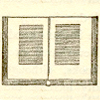
Figure 1
Click For Larger Image
The Opening as a Unit of Design From William Morris, Arts and Crafts Essays (London: Longmans, Green, 1903). Image courtesy of Thomas Fisher Rare Book Library, University of Toronto.CLOSE or ESC
For all its ubiquity, the opening has often been underacknowledged in our tendency to think of books as objects made of leaves Leaf the sheet of paper or parchment with one page on its front side (recto) and another on its back (verso). See: Recto Verso Page Codex CLOSE or ESC and pages Page one side of a leaf. See: Recto Leaf Verso PDF Pagina Layout Pagination CLOSE or ESC. As John Dagenais puts it, “in practice, the overwhelming majority of pages [...] in both handmade and printed books, are, in fact, two pages: a verso page on the left and a recto on the right. [...] In the real world ‘the page’ is almost always accompanied by a failed mirror image of itself, a lost twin.”1 One of the most influential advocates of this idea was Victorian designer William Morris, whose Kelmscott Press operated on the principles that “we only occasionally see one page of a book at a time; the two pages making an opening are really the unit of the book, and this was thoroughly understood by the old book producers.”2 In Morris’s view, the book manufacturers who ignore this in their designs, and the binders who disrupt those designs by chopping off carefully planned margins Margin white space surrounding the area taken up by printed matter. See: Back Margins Head Foot Manicule Marginalia CLOSE or ESC, betray longstanding design traditions handed down from the past—and more to the point, they betray the readers whose experience of the text should be served by those designs. Robert Bringhurst describes how the past and future of page geometries connect bookmakers on a long continuum: “The first European typographers inherited some two thousand years’ worth of research into these principles from their predecessors, the scribes. Yet the principles are flexible enough that countless new typographic pages and page-spreads wait to be designed.”3 Whether the opening will persist in the digital age remains to be seen.
The horizontally opening scrolls Scroll a textual form made of a single rolled substrate. Read by unrolling horizontally See: Roll Pagina CLOSE or ESC (as distinct from vertically opening rolls Roll a textual form made of a single rolled substrate. Read by unrolling vertically. See: Scroll CLOSE or ESC) that originally predated the codex in the West had no default unit of viewing, though their columnar layout in paginae Pagina a text column in a scroll See: Scroll Page CLOSE or ESC and the width of the unscrolled section defined what could be visible to a reader.4 By the time the codex had become a dominant form in the 3rd century AD, its structure of bound gatherings meant that the rhythm of reading included the turning of leaves and the visual traversing of the gutter.
Figure 2
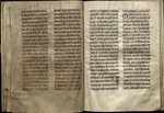
Click For Larger Image
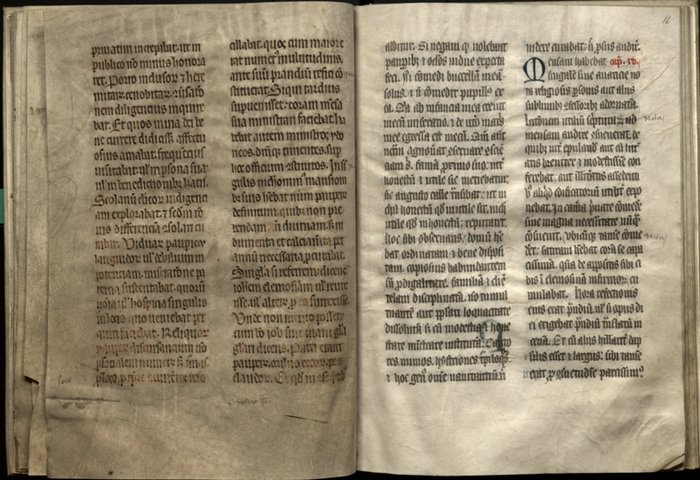
An exception to the Rule of Gregory An example of hair and flesh sides facing each other in a medieval manuscript book. From William de Wycumbe, Vita venerabilis Roberti Herefordensis episcopi (Llantony Secunda: ca. 1200). Image courtesy of Thomas Fisher Rare Book Library, University of Toronto.CLOSE or ESC
Makers of medieval books took account of the visual unity of the opening in their construction. Parchment Parchment the hide of a sheep or goat prepared for being written or printed upon. See: Substrate Vellum CLOSE or ESC and vellum Vellum the hide of a calf prepared for being written or printed upon. See: Substrate Parchment CLOSE or ESC, even after it has been scraped, stretched, and prepared for writing, tends still to show whether it faced the inside or outside of the animal that supplied it. Scholars of medieval books refer to the flesh side and hair side of leaves, and it is often possible to discern between the two, even covered in writing and bound in a book. Generally, the hair side is darker and shows the pores of the sheep, calf, or goat from which it came. Makers of medieval books often took this difference into account when arranging the order of leaves, so as to avoid the visual dissonance that would result from hair- and flesh-side pages facing each other. According to the Rule of Gregory (also known as Gregory’s Law, after its discoverer, Biblical textual scholar Caspar René Gregory), normally an opening is either flesh-side or hair-side entirely.5 The rare departures from this pattern usually indicate some form of bibliographical disturbance (such as an excised leaf) in the book’s past.
Figure 3
Click For Larger Image
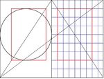
Canons of Page Construction A Representation of Tschichold’s theory of the canons of page construction. Image Source: http://en.wikipedia.org/wiki/Canons_of_page_construction. CLOSE or ESC
In the twentieth century, scholars of book design investigated the proportions of pages and textblocks in medieval books, and noticed patterns that suggested many medieval bookmakers thought carefully and systematically about the opening as a visual unit. The most well-known investigator in these matters, the typographer Jan Tschichold, identified what he called a golden canon of page construction, in which the dimensions of pages were determined by measuring the proportions of distances across the entire opening of the book. A common ratio in medieval design appears to be 2:3, but Tschichold also argued that the golden ratio (21:34; also known as the golden section and the golden mean) can also be found in manuscript Manuscript any document in which the text is written by hand. See: Script CLOSE or ESC books and incunabula Incunabula books printed before 1500. CLOSE or ESC. These proportions, and the symmetries they generate across openings, determine whether a book’s geometries are antiphonal or polyphonic, thus shaping the reading experience in ways that are felt but not noticed, like the harmonic structure of music.6
As a feature of the codex, the opening plays a crucial role in the history of the relation of text and image. In Europe, the mechanical reproduction of images predates Gutenberg by at least a century and a half in the form of woodblock Woodcut a printed illustration made from a design cut into a block of wood. See: Cut CLOSE or ESC printing. With the invention of the printing press, moveable type, printable paper, and other elements of the hand-press era book, text had caught up to images in terms of reproducability. The power of hand-press printing to integrate text and image is attested by the relative stability of the technology until the late-eighteenth and early-nineteenth centuries. As Michael Twyman reminds us in his 2000 Panizzi lecture on lithography Lithography method of printing where the printing surface is chemically treated so that ink sticks to the parts to be printed and is repelled from the areas to be left blank. CLOSE or ESC (a technology discussed in more detail below), lithographic techniques of the nineteenth century stand as “the first essentially new method of printing to have been developed since the fifteenth century—the first alternative, that is, to the well tried methods of printing type from wood blocks on the one hand and copper plates on the other.”7 The development of printed books in the Renaissance, in the meantime, suggests that the opening had become a meaning-making device in the print world, and had become newly visible in the consciousness not only of printers, but also of authors and their readers. Pages of printed books began to acknowledge their “lost twin,” as Dagenais terms it, on the opposite side of the gutter.8
Figure 4
Click For Larger Image
Thomas More’s Utopia from Thomas More, Utopia (Basel, March, 1518). Image courtesy of General Collection, Beinecke Rare Book and Manuscript Library, Yale University.CLOSE or ESC
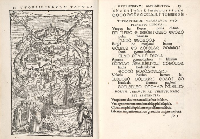
A subtle manipulation of the opening may be found in the edition of Thomas More’s Utopia printed in Basel in 1518. Its printer, John Froben, was one of the foremost humanist printers, and a close collaborator with More, Erasmus, and the humanist circles to which they belonged. His editions of Utopia improved upon those printed in Louvain (1516) and Paris (1517), and are generally regarded as the most authoritative and carefully printed of the early Latin editions of More’s work. They are also the most elegantly designed, and feature woodcuts by Ambrosius Holbein, brother of renowned painter and printmaker Hans Holbien. The text of Utopia is ostensibly a tale recounted by the mariner Raphael Hythloday to More and his companions, about Hythloday’s voyage to an ideal (or at least imaginary) commonwealth in the Atlantic. Numerous framing devices surround Hythloday’s story, including the complex set of prefatory letters and other items that form the paratext Paratext material included in a book or other textual form that is not considered part of the "main" text; e.g. title pages, tables of contents, prefatory letters, advertisements, indices, etc. See: Preliminary Leaves CLOSE or ESC of Utopia. Most graphically striking of these is a diagram of the island of Utopia, drawn by Ambrosius Holbein, which appears in an opening across from samples of the Utopian language, rendered in the Utopian alphabet and transliterated in Roman letters. The design here uses the opening to enhance the text-image juxtaposition in several ways. The Utopian poem at the bottom of the recto speaks in the voice of the island itself, depicted on the opposite page: “My king and conqueror Utopos by name, [...] Hath made me an isle that erst no island was.”9 Yet this text is not simply a caption, describing the origins of the island opposite; the poetry and alphabet on the right are also textual artifacts brought back by Hythloday, like exotic plant or animal specimens. The gutter between them materializes the gap between sign and referent, evidence and story, and real and imagined worlds that Utopia opens between its many frames, making it such a fraught text for interpretation. That gap is emphasized and diminished in the same gesture by the figure of Hythloday in the verso’s lower left, who appears to be recounting his voyage to More, standing next to him (presumably back in Europe; the image conflates moments in time). Hythloday’s pointing hand—like a manicule Manicule a mark found typically in the margin of a text, either drawn by hand or printer, in the shape of a hand, or pointing fist. Generally, manicules are used to indicate notable passages. Other names for the manicule is the printer's fist, or mutton fist. See the ArchBook essay Manicules for more details. See: Margin CLOSE or ESC—leads the eye not just to the island above him, but also across the opening to the poems on the other side. In this one opening at the beginning of the book, design and text conspire to warn the reader of Utopia’s thoroughly interpreted nature—someone is always speaking for the island, and readers must judge credibility gaps for themselves.
Figure 5
Click For Larger Image
The Title Page from Shakespeare’s First Folio From Mr. William Shakespeares Comedies, Histories, & Tragedies [the First Folio] (London, 1623). Image courtesy of Folger Digital Image Collection, Folger Shakespeare Library.CLOSE or ESC
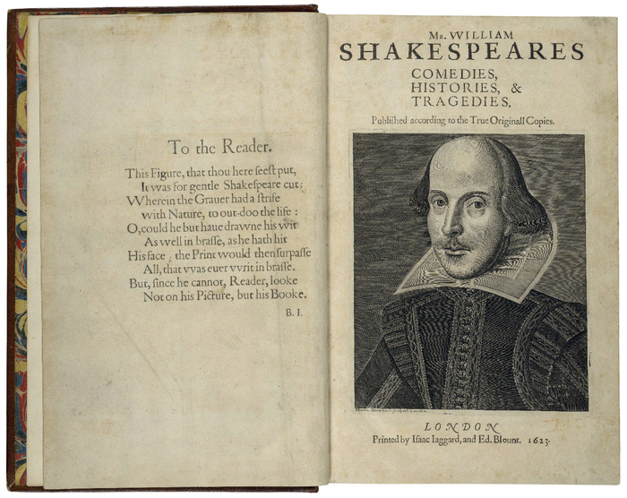
With print came the title page, and one of the most well-known appears in the 1623 volume Mr William Shakespeares Comedies, Histories, & Tragedies—better known as the Shakespeare First Folio, as the first of four single-volume collections of Shakespeare’s dramatic works in the large folio Folio a sheet of paper folded in half to make two leaves / four pages. Can also refer to the leaf number of a foliated book. See: Format CLOSE or ESC format. Although the title page and its iconic engraving (by Martin Droeshout) circulates to this day in every form from t-shirts to tea towels, less often do we see its full bibliographic context as part of an opening. In this example, we can see the opening being used to juxtapose text against image. The poem “To the Reader” printed on the verso was contributed by Shakespeare’s great friend, colleague, and rival Ben Jonson, whose own 1616 folio collection of plays and poems was a prototype for the Shakespeare First Folio of 1623. Where the frontispiece Frontispiece an illustration facing the title-page of a book. CLOSE or ESC to Jonson’s and other literary collections shows the author surrounded by classical ornamentation, placing him visually in the ranks of canonical Greek and Roman poets, the image of Shakespeare is different. Here we have a modern writer in modern dress, without laurels or benedictions from the Muses. Along with this unconventionally realistic image, we also have the book’s assertion that the comedies, histories, and tragedies in this volume were “Published according to the True Originall Copies” (the last word meaning, in ambiguous early modern English, both reproduction and source). Across the opening, Jonson’s poem comments on the image facing it, noting the limits of visual representation and undermining its capacity to give a true original picture of the real Shakespeare—his “wit,” not just his “face.” Coming as it does first in the conventional reading order of pages (from left to right) but competing with the power of images to arrest readers’ attention, the poem and title page were made to be viewed together, as a single unit—even if its parts compete with each other. As Jonson says, the point is not to dwell on Shakespeare’s picture, but on the significance of the book as a totality.
Figure 6
Click For Larger Image

The Opening of the Poem Easter Wings From George Herbert, The Temple: Sacred Poems and Private Ejaculations (Cambridge: Thom Buck and Roger Daniel, printers of Cambridge University, 1633). Image courtesy of Folger Shakespeare Library.CLOSE or ESC
A third example shows how the whole book as an object can be brought into play by the meaning-making strategies provided by openings. George Herbert’s poem (or poems) “Easter Wings,” first printed in his collection The Temple in 1633, offers one of the most radical poetic uses of the book’s opening. In its original printed form, the poem stands as something of a challenge to the reader, who must figure out how to read it. When held normally, the poem appears to be more shape than text, suggesting sets of wings like those of angels or the Holy Spirit in the form of a dove. In order to read the poems, one must rotate the book (or one’s head) accordingly. Even when rotated, however, the placement of the two stanzas (or two poems) on either side of the opening creates an ambiguity: does one begin with the poem at the top when turned sideways (“My tender age”), or with the one placed on the left-hand page when the book is held normally (“Lord, who created”), where convention tells us we should begin reading in an English book? All this turning of the book to and fro also calls attention to its physical form, in this case a small duodecimo Duodecimo sometimes also referred to in English as 'twelvemo'; A sheet of paper commonly cut and folded in such a way as to make 12 leaves/24 pages. For diagrams of the various methods used to acheive a duodecimo format, see Gaskell, A New Introduction to Bibliography. See: Format CLOSE or ESC, and to the reader’s own embodiment in ways that, say, a large folio volume laying flat on a desk might not.10
“Easter Wings,” then, is not just a concrete poem; it is a haptic poem, inviting readerly manipulation of the book form as part of its poetic strategy. In this case, the opening functions semiotically not only as a boundary between visual fields, emphasizing the symmetry of the poem’s graphical and thematic dualisms, but also as the physical hinge by which the book opens and closes. In closing the book, two very important things happen: the two sets of wings on opposite pages—one belonging to man and the other to God—are “imped,” or brought together, in the way called for by the poet’s prayer; also, the reader’s own hands close naturally upon the book’s outside covers as though in prayer. Here we see the opening being exploited not only to emphasize the distance between the things on either side, but also as a physical embodiment of the spiritual unity (or reunion) promised in the poem.11
Figure 7
Click For Larger Image
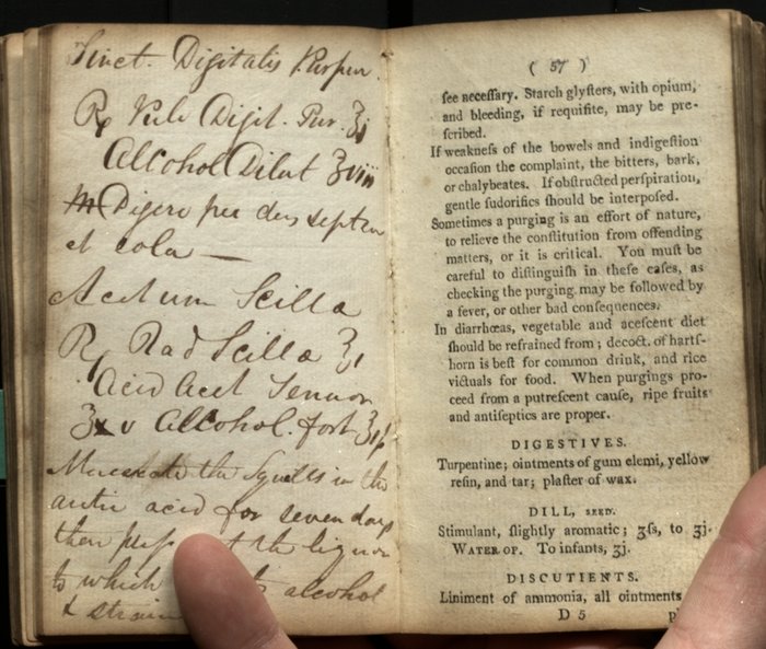
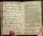
A Medical Pocket-Book A medical handbook interleaved with blank pages for annotation. From John Elliot, The Medical Pocket-Book. Containing a Short But Plain Account of the Symptoms, Causes, and Methods of Cure of the Diseases Incident to the Human Body, 5th ed. (London: J. Johnson, 1800). Image courtesy of Thomas Fisher Rare Book Library, University of Toronto.CLOSE or ESC
So far we have been examining openings as part of the original design of books, but this aspect of the book’s structure also plays a crucial role in books as writing surfaces for their owners. Books in which readers were expected to make notes were sometimes interleaved Interleaf the inset of an additional page in a codex See: Grangerize CLOSE or ESC with blank pages to permit annotation on the facing recto or verso. For example, the pocket-sized medical handbook pictured here lists symptoms, treatments, and substances alphabetically, enabling quick reference, but also binds printed leaves with blank ones so that writing space is available on most facing pages. The opening serves to divide the printed medical information on the one side (“Extracted from the Best Authors, and Digested Into Alphabetical Order,” as the book’s title advertises) from the reader’s own additional information on the other. The reader’s annotations serve, in a sense, to complete the book, balancing the shared knowledge of medical science with the traces of individual experience, facing each other across the opening. Note that this particular edition was printed in such a way as to enable printing without interleaving, as only the printed leaves are part of the sequence of signatures Signature a number or letter printed on the first page of each section to serve as a guide to gather them in the right sequence. Sometimes used in place of 'gathering.' See: Collate Gathering CLOSE or ESC and page numbers.
As a system for interacting with printed text via manuscript, the book interleaved with blank pages was also suited to lengthy textual projects, not just quick notes. (A related form of book customization known as grangerizing Grangerize the act of inserting additional illustrative content to a codex that is not included in the original volume See: Interleaf CLOSE or ESC integrates leaves from other books—often images facing text—added by readers to supplement the original contents.) One of the most well-known literary examples of interleaving is the special set of the Waverley novels printed for their author, Walter Scott, by his publisher Archibald Constable beginning in 1825.12 Scott undertook the massive project of annotating, correcting, and revising his already prolific body of work, and Constable created a set of Scott’s own novels interleaved with blank pages for Scott to record his notes and revisions. Volumes from the set survive to this day, and provide an immensely valuable record of an author revisiting his own texts as part of a sustained publishing project. As with the Medical Pocket-Book mentioned above, the opening becomes a way of spatializing the relationship between printed and written text. In both cases, the opening serves as a kind of threshold, where the supposed permanence of knowledge in print meets the mutability of worldly contexts in the form of readerly annotation. The term marginalia Marginalia anything appearing in the margins of a text, including printed and manuscript notes, and decorations. See: Margin CLOSE or ESC does not do justice to the relationship imagined by the interleaved book; rather, the author and reader alike are allotted equal space, balanced across the opening, though the reader always has the last word.
Figure 8
Click For Larger Image
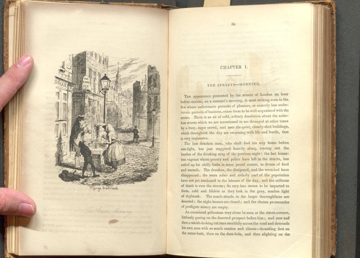
An Opening of Sketches By Boz A sample page spread that juxtaposes Charles Dickens’s text and George Cruikshank’s illustrations. From Charles Dickens, Sketches By Boz, Illustrative of Every-Day Life and Every-Day People (London: Chapman and Hall, 1839). Image courtesy of Thomas Fisher Rare Book Library, University of Toronto.CLOSE or ESC
The rise of the novel in the eighteenth century, coupled with the industrialization of printing in the nineteenth, at first seem to be conditions antithetical to the kind of literary books that exploit textual features like openings. To a large extent this is true, and it was the industrialization of printing, and of life in general, that prompted Morris’s reactionary ideas about book design. Walter Benjamin commented that lithography, a late eighteenth-century offset printing technique that flourished in the nineteenth century, for the first time “enabled graphic art to illustrate everyday life,” and to “keep pace with printing.”13 That impulse can be seen in non-lithographic pairings of text and image in the same period, such as the engravings of everyday life supplied by George Cruikshank for Charles Dickens’s Sketches By Boz. As in nearly all of Dickens’s work, the social realism of the narrative on one side of the opening complements the images of Victorian life found on the other. An increasingly image-hungry readership, along with the parallel rise of lithography, and later photography, in the nineteenth century meant that books with images became increasingly popular, and with them the kinds of image-text relationships that thrive across the opening.
The popularity of comic books and graphic novels in the twentieth century brought new techniques and vocabularies to the graphic design of books. In these forms, images were not simply handmaidens to narrative in the form of illustrations; rather, image and narrative became one and the same, and were intimately tied to physical form. An example of textual symmetry may be found in Alan Moore’s graphic novel Watchmen, a tale of superheroes set in an alternate-history version of the late twentieth century, published in 1986–1987. Symmetry and other forms of dualism serve as structuring motifs throughout the book, both thematically and graphically, from the dyads formed by the characters and their heroic secret identities, to the ever-shifting symmetrical patterns on the mask of the aptly named vigilante Rorschach. In an issue titled “Fearful Symmetry,” mirror-image layouts use the centre spread to mark wordlessly the climactic moment in the issue (see image and read more about the structure of Watchmen here).14
Figure 9
Click For Larger Image
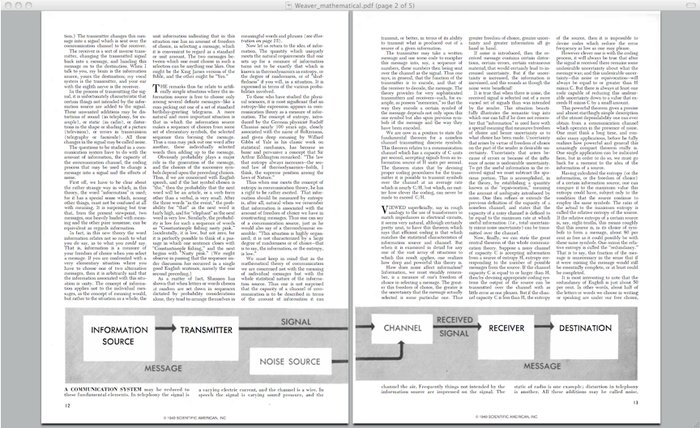
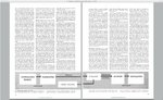
The Mathematics of Communication The Scientific American version of Warren Weaver’s "The Mathematics of Communication," as viewed in Apple’s Preview PDF reader (two page view). CLOSE or ESC
Figure 10
Click For Larger Image
The Mathematics of Communication The Scientific American version of Warren Weaver’s "The Mathematics of Communication," as viewed in Apple’s Preview PDF reader. CLOSE or ESC
Not all digital books respect Morris’s injunction to remember the opening as a unit of design. This is true both of born-digital e-books and of digitizations of codex books. For example, the Shakespeare First Folio text-image pairing shown above is not directly visible in many of the online facsimiles currently available.15 The design of web pages and screens favours vertical scrolling (though, strictly speaking, in the manner of a roll—not a scroll—which mean that screens aren’t exactly a return to the dominant Western visual form of text that predated the codex). Although formats like PDF PDF stands for Portable Document Format, an open file format developed by Adobe which is independent of the parent program. There are a range of programs available to open these documents some of which are also open source (JISC Digital Media Glossary). See: Page Display Type Layout CLOSE or ESC and Word favour the page as a basic unit, and web browsers are capable of scrolling through and reflowing text according to the reader-determined dimensions of windows, not all textual forms fit comfortably into this model. Given the opening’s centrality to the experience of reading since the invention of the codex, the design of digital reading interfaces could benefit from careful thought about the fundamental units of viewing they incorporate.
The opening becomes a noticeable representational challenge when print forms are digitized using standardized formats like PDF. These formats and their supporting software often depend upon idealized notions of the divisibility of form and content, an idea traceable to the early days of information theory in the mid-twentieth century. We can put that idea to the test by examining how one of information theory’s own foundational articles, Warren Weaver’s “The Mathematics of Communication,” changes between its first published form and its translation to PDF.16 When the article was first published in Scientific American in 1949, it included a diagram of a communications system that extends across the magazine’s opening, with certain elements of the diagram (“noise source” and “channel”) positioned to avoid the middle of the gutter. Ironically, this dramatic and appealing use of the two-page magazine spread to visualize information theory’s foundational concept may not survive its own transmission through communication systems. Although it is possible to display two PDF pages side-by-side in most reading software, the default setting usually shows single pages stacked for vertical scrolling. Even if a reader changes his or her settings to make two pages visible at once, the resulting combinations of pages will likely be determined by the arbitrary sequence of pages in the PDF file itself (which may include a cover page added by the content provider), not the original layout as designed for print. The sequence of alphanumeric characters may remain the same in all forms, but the meaning changes, as dramatized by the visual breaking of the circuit.
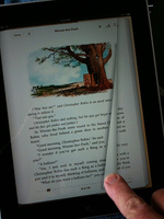
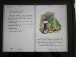
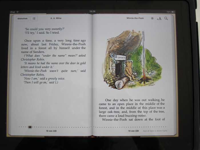
The same problems may arise with e-books designed for specific reading devices, though the physicality of the opening reasserts itself along with the physicality of some devices. Many apps on the Apple iPad will change their layout in response to the reader’s rotating the device between portrait and landscape orientations. Although many e-reading apps show only a page at a time, and simply vary the width of the page when the orientation changes (for example, the iPad apps for Kobo and Amazons Kindle e-readers), iBooks alternates between showing one page at a time in portrait mode, and a full opening in landscape mode.
Figure 11
Click For Larger Image

Winnie the PoohWinnie the Pooh on the Apple iPad, portrait mode. Image courtesy of Mike Baird, used under Creative Commons Attribution 2.0 Generic Licence.CLOSE or ESC
Figure 12
Click For Larger Image
Winnie the PoohWinnie the Pooh on the Apple iPad, landscape mode. Image courtesy of Astrid Walker, used under Creative Commons Licence.CLOSE or ESC
Combined with the page-flipping animation popular in many e-book reader apps, the availability of openings in iBooks evokes the familiar form of the codex. However, in books with images interspersed with text, such as Winnie the Pooh (which comes pre-loaded with iBooks), changing the orientation also changes the line widths, resulting in the reflowing of text and the repositioning of images. This variability, combined with the reader’s ability to change text size, means it will require different approaches to the fluidity of digital text in relation to units of viewing to achieve the precise layouts—especially the juxtapositioning of elements across openings—that evolved with codex books.
Avrin, Leila. Scribes, Script, and Books: The Book Arts from Antiquity to the Renaissance. Chicago: American Library Association, 1991.
Benjamin, Walter. "The Work of Art in the Age of Mechanical Reproduction." In Illuminations, 217-51. Translated by Harry Zohn. New York: Schocken, 1968.
Bringhurst, Robert. The Elements of Typographic Style, version 3.1. Point Roberts, WA: Hartley & Marks, 2005.
Brown, Ian Gordon, ed. Scott's Interleaved Waverley Novels (The "Magnum Opus": National Library of Scotland MSS. 23001-41). Aberdeen, UK: Pergamon Books / Aberdeen University Press; National Library of Scotland, 1987.
Dagenais, John. "Decolonizing the Medieval Page." In The Future of the Page, edited by Andrew Taylor and Peter Stoicheff, 37-70. Toronto: University of Toronto Press, 2004.
Derolez, Albert. The Palaeography of Gothic Manuscript Books: From the Twelfth to the Early Sixteenth Century. Cambridge: Cambridge University Press, 2003.
Galey, Alan, Richard Cunningham, Brent Nelson, Ray Siemens, Paul Werstine, and the INKE Team. "Beyond Remediation: The Role of Textual Studies in Implementing New Knowledge Environments." In Digitizing Material Culture, from Antiquity to 1700, edited by Brent Nelson and Melissa Terras, 21-48. Toronto & Tempe, AZ: Iter/Arizona Centre for Medieval and Renaissance Studies, 2012.
Gregory, Caspar Rene. Canon and Text of the New Testament. Edinburgh: T. & T. Clark, 1907.
Internet Shakespeare Editions, University of Victoria. http://internetshakespeare.uvic.ca/Library/facsimile/book/SLNSW_F1.
Mak, Bonnie. How the Page Matters. Toronto: University of Toronto Press, 2011.
McLeod, Randall [Clod, Random]. "Gerard Hopkins and the Shapes of His Sonnets." In Voice, Text, Hypertext: Emerging Practices in Textual Studies, edited by Raimonda Modiano, Leroy F. Searle, and Peter Shillingsburg, 177-297. Seattle: University of Washington Press, 2004.
More, Thomas. Utopia, in Three Early Modern Utopias. Susan Bruce, ed. and introd. Oxford : Oxford University Press, 1999.
Morris, William. "The Ideal Book" [1893]. In The Ideal Book: Essays and Lectures on the Arts of the Book, edited by William S. Peterson. Berkeley, CA: University of California Press, 1982.
Schoenberg Centre for Electronic Text & Image, University of Pennsylvania. http://sceti.library.upenn.edu/sceti/printedbooksNew/index.cfm?textID=firstfolio.
Shannon, Claude E. and Warren Weaver. The Mathematical Theory of Communication. Urbana: University of Illinois Press, 1949.
Tschichold, Jan. The Form of the Book: Essays on the Morality of Good Design. Translated by Hajo Hadeler, edited by Robert Bringhurst. Vancouver: Hartley & Marks, 1991.
Twyman, Michael. Breaking the Mould: The First Hundred Years of Lithography. London: British Library, 2001.
"Watchmen (Structure Section)" Wikipedia. Last modified May 4, 2012. http://en.wikipedia.org/wiki/Watchmen#Structure.
Weaver, Warren. "The Mathematics of Communication." Scientific American, 181.1 (July, 1949): 11-15.
William Shakespeare Digital Collection, University of Miami. https://digital.lib.miamioh.edu/digital/collection/wshakespeare.
 Supported by the University of Saskatchewan Humanities and Fine Arts Digital Research Centre. Initially created with the support of the Social Sciences and Humanities Research Council of Canada. Licensed under a Creative Commons Attribution-Noncommercial-No Derivative Works 3.0 License