ArchBook: Architectures of the Book
Published 1 December 2021
Nota Bene: This article was first written in 2012 for publication in Archbook, a digital encyclopaedia of the book. When this publication project was temporarily suspended, parts of this article found their way into the chapter “The Page: Its Past and Future in Books of Knowledge,” in Social Knowledge Creation in the Humanities: An Open Anthology, edited by Alyssa Arbuckle, Aaron Mauro, and Daniel Powell, Iter Press, 2017 (https://ntmrs-skc.itercommunity.org/).
A page is one side of a leaf Leaf the sheet of paper or parchment with one page on its front side (recto) and another on its back (verso). See: Recto Verso Page Codex CLOSE or ESC of paper or parchment Parchment the hide of a sheep or goat prepared for being written or printed upon. See: Substrate Vellum CLOSE or ESC or any other material able to receive a text or illustrations and be part of a set. The word page comes from the Latin word pagina, which designates a column of writing or, originally, a row of vines in a rectangle. Pagina is derived from the verb pangere, meaning “to mark out the boundaries, or plant vines in a vineyard.” As far back as one can go, then, the notion of “a page” implies a space carefully demarcated for inscribing and reading.
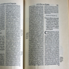
Figure 1
Click For Larger Image
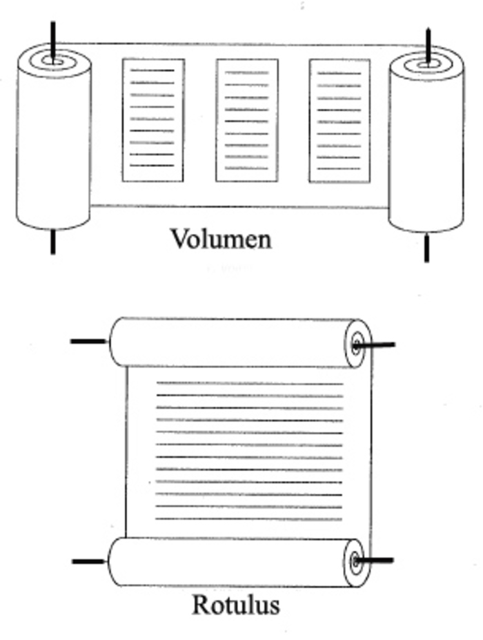
The volumen unrolls horizontally, contrary to the rotulus at the bottom. Image courtesy of Audih [CC BY-SA 4.0 (https://creativecommons.org/licenses/by-sa/4.0)].CLOSE or ESC
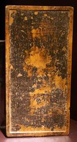
Figure 2
Click For Larger Image
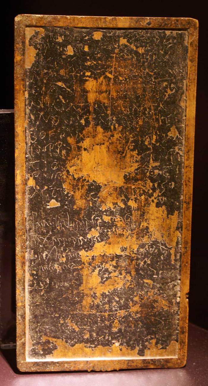
Wood tablet covered with wax used as a writing pad in the Roman Empire. 1st century A.D. Museo de Santa Cruz, Toledo, Spain. Image courtesy of Christian Vandendorpe.CLOSE or ESC
The page as a space for writing an inscription is as old as writing itself, because “writing necessitates the marks of its own limits.”1 As such, the clay tablet in use in Babylon since around 3500 BCE and which lasted for three thousand years was a “page,” but this page was of a special type since it did not allow text to stop in the middle of a sentence.2 A text could, however, continue over a series of tablets, each one being numbered and occasionally displaying the title of the work, the number of lines of the individual tablet, and the name of the copyist.3 The shape of the tablet could also vary according to the type of text: round for bookkeeping, square for poetry, and the shape of a liver for divinatory texts.4
Figure 3
Click For Larger Image
The Luttrell Psalter, made in Lincolnshire, c. 1320-1340 (London, British Library, MS. Additional 42130, fols. 179v-180r). Image courtesy of the British Library.CLOSE or ESC
In the volumen or papyrus scroll Scroll a textual form made of a single rolled substrate. Read by unrolling horizontally See: Roll Pagina CLOSE or ESC, the “pagina” or page corresponds to the column of text. In most scrolls, the column width varies from six to eight cm in length and holds about 25 to 45 lines, with an intercolumn margin of 2 to 2.5 cm.5 These proportions “remain remarkably stable.”6 Contrary to a common misconception, the volumen unrolls horizontally, unlike the vertical standing rotulus, which served essentially for public proclamations in theatrical, liturgical, or administrative settings and where the page encompasses the total length of the roll Roll a textual form made of a single rolled substrate. Read by unrolling vertically. See: Scroll CLOSE or ESC (Figure 1.)
Figure 4
Click For Larger Image
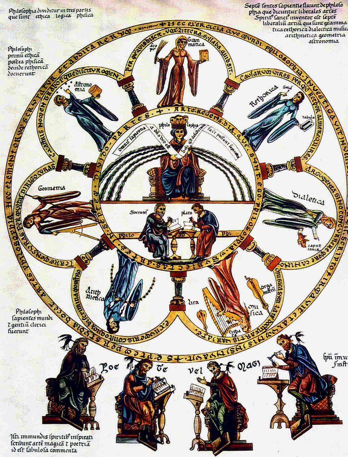
Allegorical representation of the seven liberal arts in Hortus deliciarum. Image courtesy of Wikimedia Commons.CLOSE or ESC
The page changed drastically and took on its present meaning around the first century, with the advent of the codex Codex a book format made of stacked leaves that are attached together along one edge. See: Binding Edge Format Leaf CLOSE or ESC in the Roman Empire. The codex was first a gathering Gathering the group of leaves created when a single sheet is folded, or when multiple sheets are nested or 'quired' together (as, for example, in the format "folio in 6s" which is created by quiring three folia). See: Signature Format CLOSE or ESC of thin wooden tablets, bound by strings and coated with coloured wax (Figure 2). Being easy to erase, these tablets were used for drafts or school exercises.7 In the first century, wood was replaced by papyrus and then by parchment. With parchment, it was possible to use both sides of the page. The folding of the sheet Sheet a whole piece of paper. CLOSE or ESC in two or in four and the subsequent binding Binding Edge the bound edge of a book. See: Back Back Margins Codex CLOSE or ESC of the sheets produced the codex. The page thus became an autonomous unit as well as part of a totality. In this new format Format a bibliographic distinction that includes how one or more sheets is folded and gathered into a quire and how the type-pages are arranged into a forme (also known as the imposition format). For example, the phrase "folio in 6s" describes a book's format in which three sheets are folded in half and the resulting folia are nested to create a gathering of 6 leaves; "inverted octavo", on the other hand, describes a sheet folded three times to acheive 16 pages, with an imposition format that prints pages 9-16 at the outer corners of the sheet rather than placing those pages in the middle of the forme. See: Vicesimo-Quarto Quarto Duodecimo Tricesimo-Secundo Gathering Sextodecimo Folio Codex CLOSE or ESC, the book gained in density and was much easier to handle than the scroll. Moreover, it freed the reader’s hands. As the codex can stay open on any particular pairing of pages (an opening Opening facing pages of a book or other work with bound or folded pages. See: Centre Spread Page Spread CLOSE or ESC), the text gains new possibilities for conveying visual information and invites illuminations. As a result, "the readable gradually moves into the realm of the visible."8
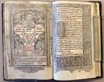
Figure 5
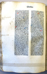
Click For Larger Image
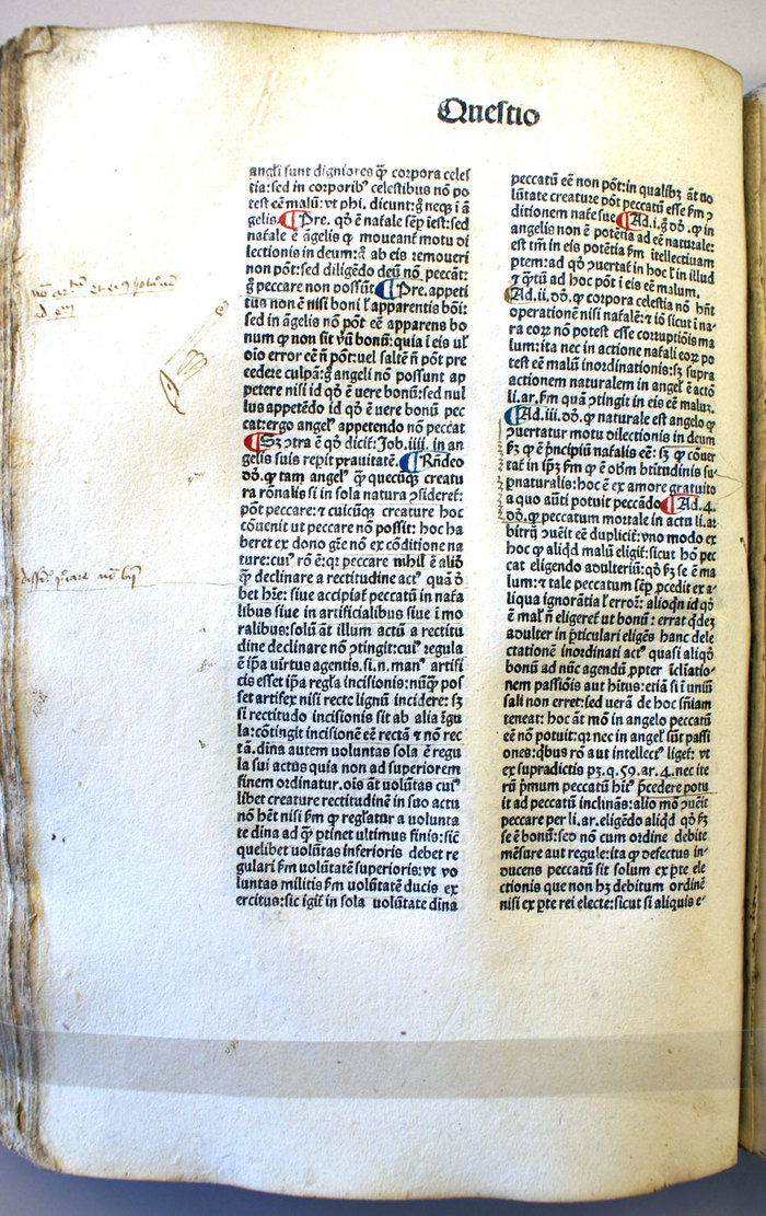
This incunabulum of Thomas Aquinas's Summa Theologica, printed in 1477 in Venice, follows the manuscript tradition. The decorated initials and paragraph marks (pilcrows) are hand-drawn. The first lines are in larger letters. There is no pagination. The layout of the text in two columns and its organization in the form of questions and answers make it very readable. Queen's University, Kingston, Ontario. Image courtesy of Christian Vandendorpe.CLOSE or ESC
The richness of the visual dimension is the main characteristic of the illuminated manuscripts Manuscript any document in which the text is written by hand. See: Script CLOSE or ESC produced during the medieval era. Scriptoria established in monasteries developed a very efficient technique for the production of illuminated codices, beginning with the Vatican Vergil (ca. 420) and followed by thousands of bibles, missals Missal the book containing the service for the celebration of mass throughout the year. CLOSE or ESC, or psalters designed to reinforce the appeal of the gospel by their sheer beauty, like the Lindisfarne Gospels (ca. 715) or the Book of Kells (ca. 800). In these books, illustration has precedence over the text. In the chain of book production, one of the most important functions pertains to the rubricator who adds illustrations, notably incipits, ornamental initials, or passages written in red ink in order to draw them to the attention of the reader. The text itself is part of the illustration and must obey its rule: this subordinate status of the text can be seen in the filling in of lines, whose purpose is to transform the whole page into a kind of beautiful picture (Figure 3).
Figure 6
Click For Larger Image
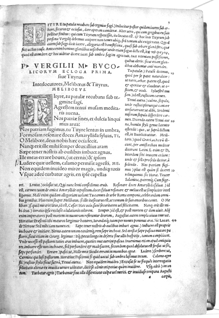
A page of a Virgil edition printed in Basel in 1544 with the commentaries by Servius and Donatus. University of Ottawa. Image courtesy of Christian Vandendorpe.CLOSE or ESC
Illustrations relied on a rich collection of symbols that were part of common knowledge. Allegorical representations were a preferred method for giving flesh to concepts and helping readers remember them, even in an encyclopaedia such as the Hortus deliciarum (Figure 4). Hugh of St. Victor could thus cherish books as a pure source of light: “The form of perfect wisdom could shine through these skins, bring letters and symbols to light, and kindle the eye of the reader. To face a book was comparable to the experience one can relive early in the morning in those Gothic churches in which the original windows have been preserved.”9
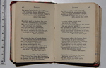
Around the 13th century, the organization of the page gained in complexity. As an answer to the needs of scholars requiring clarity and coherence, scholarly editions carefully rethought the optimal ordinatio of the text, organizing the original text and its glosses on the same page, while making sure to establish a clear distinction between them. Initials at the beginning of verses or of important sections were frequently coloured. In the column of text, a pilcrow indicated the beginning of a new development. Running titles Running-Title a repetition of the title at the top of every page above the normal text block. Also called "running-head." See: Headline CLOSE or ESC became a current practice. Moreover, thirteenth-century scribes “introduced the analytic table of contents as a guide to the ordinatio and to facilitate the readers’ access to component parts of a work.”10 Thanks to these developments, the page gained in autonomy at the expense of the linearity of the book, signalling the beginning of a new era.11 As noted by Parkes, “the late medieval book differs more from its early medieval predecessors than it does from the printed books of our own day.”12 (See Figure 5.)
The interplay of the original text with its glosses peaked in the 15th and 16th centuries as Renaissance scholars wanted to be able to read original works in Greek and Latin and to have simultaneous access to their main glosses and commentaries on the same page or opening. Scholarly editions of ancient texts gave the dominant place to the original verses in roman typeface Typeface a particular design of type. See: Face Type x-height Ascenders CLOSE or ESC and arranged the commentaries around it in a smaller italic typeface. Blank spaces served as a separator between commentaries. Lines were numbered to allow easy referencing (Figure 6). This model of layout Layout a plan for the appearance of a piece of printed work. See: PDF Page CLOSE or ESC has been called typographie foisonnante (“complex layout”) by French typographer Fernand Baudin.13 The tabular organization of the page extended to all types of content.
During the following century, scholarly books as well as religious ones still presented notes and glosses in the margin Margin white space surrounding the area taken up by printed matter. See: Back Margins Head Foot Manicule Marginalia CLOSE or ESC. One can also find books offering in their margins a précis of the text in the main column in order to facilitate the reader’s navigation (Figure 7). In the case of the Polyanthea, a reference book with multiple reissues since its first publication by Nani Mirabelli in 1503, the Venice edition of 1592 uses marginal notes either for referencing the source of a citation, for offering a précis, or for signalling the names of the different contributors.14 In the 17th century, however, a competing system was put in place, relegating marginalia Marginalia anything appearing in the margins of a text, including printed and manuscript notes, and decorations. See: Margin CLOSE or ESC to the bottom of the page in the form of footnotes Footnote note printed at the bottom of the page. See: Shoulder-Note Endnote Side-Note CLOSE or ESC, which is less distracting for the reader while “counter[ing] scepticism about the possibility of attaining knowledge about the past.”15
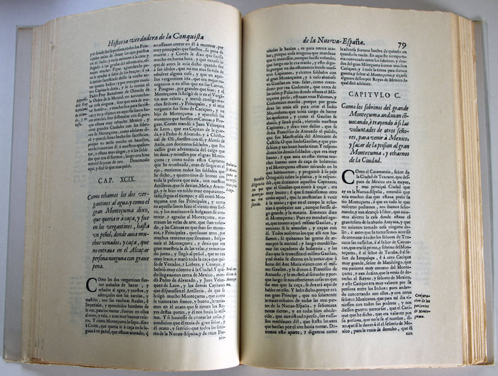
The idea that the page should not be encumbered by a parallel text gained in acceptance at the end of the 18th century, due to the fact that the novel was on its way to become the main genre, ahead of poetry and drama, and would soon impose its ideal of continuous reading onto all types of books. In 1789, even an historian like Edward Gibbon had his footnotes relegated to the end of the book because he saw them as a cumbersome distraction for the reader.16 (See Figure 8.) This way of privileging continuous reading over the scholarly model is still dominant today in most university presses across America and illustrates the fundamental tensions at play in the space of the page, where the linearity of reading conflicts with the tabular dimension of scholarly texts.
Figure 7
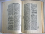
Click For Larger Image
A double page from Historia verdadera de la conquista de la Nueva España, by Bernal Diaz del Castillo, Madrid 1632. This book has a single foliation for every double page. Image courtesy of author.CLOSE or ESC
Figure 8
Click For Larger Image
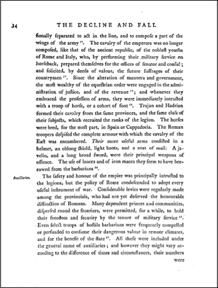
A page from a 1789 edition of The Decline and Fall. Image courtesy of Google Books.CLOSE or ESC
Figure 9
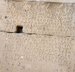
Click For Larger Image
A code in boustrophedon on a wall of the Odeon. Gortyne, Crete. 480-460 BCE. Image courtesy of Christian Vandendorpe.CLOSE or ESC
Because language has been learned primarily through its acoustic-verbal dimension, reading, even when completely silent, always involves zones of the brain associated with processes of verbalisation. By uniting in the same space the aurality of language and the visibility of text, the page is thus the scene of a tension between “two antagonistic yet complementary sources of energy.”17
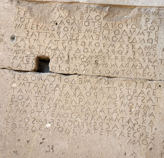
Figure 10
Click For Larger Image
A page from a late antique manuscript of Vergil. Image courtesy of Wikimedia Commons (http://en.wikipedia.org/wiki/File:Vergilius_Augusteus,_Georgica_141.jpg).CLOSE or ESC
Writing has long been conceived as the transcription of a conversation or an oral narrative, with sentences linked in a continuous thread. This linear thread of text was best exemplified in the archaic boustrophedon writing that imitated the plow working a field in a continuous path (Figure 9). Even after this mode of writing had been abandoned, the linearity of oral discourse was still dominant in the Roman writing system whose scriptio continua did not separate words (Figure 10). This perfect linearity of writing took its cue from the linearity of verbal language: in an oral culture, text had to be uttered vocally in order to be understood since reading was essentially an auditory experience. Rich Romans did not even bother to read, but listened to the text being read by a slave. As a consequence, hearing was for many centuries first and foremost in the hierarchy of the senses, and considered the sense best suited to foster a deep understanding.18 Silent reading began to develop only around the 11th century and took time before becoming common practice.
The materiality of the page also had a role in freeing the text from its oral roots. While the columns of text in a volumen had to be unrolled in a strictly linear way, which “encouraged a practice of continuous reading,” the codex could open at any given page.19 With the advent of the codex, writing was thus able to be seen as detached from the linear thread of verbal language and progressively entered the realm of tabularity, where “readers can visually access data in the order they choose, identifying sections of interest beforehand, in much the same way as when looking at a painting the eye may contemplate any part.”20 A tabular text is a combination of language and visual markers. By fostering a steady trend toward tabularity, the invention of the codex was of tremendous importance for our civilization, “enabl[ing] selective, non-continuous reading [and] thus contributing to the development of mental structures in which the text is dissociated from speech and its rhythms.”21
Over the course of history, various visual markers were introduced in order to bring language under the control of the eye and make reading more efficient: word-spacing (around 700 CE); ornamental initials; signs of punctuation (between 700 and 1600); paragraph markers and division into paragraphs (with or without indentation); manicules Manicule a mark found typically in the margin of a text, either drawn by hand or printer, in the shape of a hand, or pointing fist. Generally, manicules are used to indicate notable passages. Other names for the manicule is the printer's fist, or mutton fist. See the ArchBook essay Manicules for more details. See: Margin CLOSE or ESC; page numbering; running titles, etc. The organization of the book was also modified in order to accommodate readers’ requests, with tables and summaries allowing the reader to go directly to the section of interest to her; the invention of the index (around 1200) further advanced the reader’s right to wander at will across a book. In the 20th century, the magazine pushed tabularity still further by segmenting text into small blocks and mixing them with illustrations in a starry layout.
The page has been defined as “a temple made of writing where reading will be practised.”22 As such, it is carefully designed in order to seduce the eventual reader and entice her to delve into the text. Through the course of centuries, scribes, illuminators Illuminator in manuscript and early book production, the person responsible for decorating the text or drawing in the initial letters. CLOSE or ESC, typographers, printers, and publishers have perfected the various components of the page.
The natural shape of the page is a rectangle whose orientation is vertical (“portrait”). The verticality of the codex dates back to the Sumerian tablet and was also the norm for the columns of text in the volumen. Some analysts suppose that this shape is symbolically linked to the vertical space of the hand.23 It is also rooted in the physiology of vision, humans being better equipped to read short lines of text than long ones: “as the eye proceeds in a jerky fashion, the longer a line of characters, the greater the risk that the eye loses track of the line on which it is fixed.”24 In ancient Greek papyri, a line was six or seven centimetres in width, the same as columns of today’s magazines and newspapers. In the Dead Sea scrolls of the Psalms, “the column width was between eight and eleven centimetres,” comparable to a standard paperback of today.25 When very long lines are chosen over shorter ones, it is generally a sign that “the emphasis is on the writing instead of the reading, and that writing is seen as an instrument of power, not an instrument of freedom.”26
Far from being decided at random, the ratio between height and width is the result of careful decisions aimed at attaining perfect proportions or giving a specific signature Signature a number or letter printed on the first page of each section to serve as a guide to gather them in the right sequence. Sometimes used in place of 'gathering.' See: Collate Gathering CLOSE or ESC to books published in the same series. It must be noted that this ratio is measured on the basis of a double page spread (i.e. “opening Opening facing pages of a book or other work with bound or folded pages. See: Centre Spread Page Spread CLOSE or ESC”), since “the double page is, as far back as scribes and typographers remember, the visual unit of the book.”27 The Canadian poet and typographer Robert Bringhurst compares this relationship to a musical scale:
The page is a piece of paper. It is also a visible and tangible proportion, silently sounding the thoroughbass of the book. On it lies the textblock, which must answer to the page. The two together -- page and textblock -- produce an antiphonal geometry. That geometry alone can bond the reader to the book. Or conversely, it can put the reader to sleep, or put the reader’s nerves on edge. Or drive the reader away.28
According to Stoicheff and Taylor, “The width-to-length ratio of the average contemporary page, the medieval parchment page, the ancient stone and wax tablets, and the human hand, is essentially a consistent 5:8 (or 0.61).”29 This ratio has been called the golden ratio and is deemed to be particularly attractive to the eye. In fact, different ratios have been in favour at different times. As noted by Bringhurst, “the perfect intervals (2:3 and 3:4) coincide exactly with the favourite page shapes of the European Middle Ages [while] Renaissance typographers made extensive use of narrower pages [i.e. the golden ratio].”30 This same proportion is still in use today in the Penguin Classics series, whose page size is 111 x 180 mm.31
Figure 11
Click For Larger Image
This book of hours published by Thielman Kerver in Paris in 1511 is a cross between an almanac and a prayer book and is still very much in the manuscript tradition. Queen's University, Kingston, Ontario. Image courtesy of Christian Vandendorpe.CLOSE or ESC
The size of the page is also relative to the material used. Sheets of papyrus were generally 25 x 19 cm, the height of the sheet being “in part restricted by the natural limitations of the papyrus plant, the usable stems of which rarely exceeded 40 centimetres in length.”32 Sheets were pasted together according to the length of the manuscript, easily reaching 10 metres or more. A column of text, which in a scroll corresponds to the page, was composed of between 25 and 45 lines.
Figure 12
Click For Larger Image
A folio book printed in 1659 (36.5 cm x 23 cm). This format was used for anthologies, dictionaries, and encyclopaedias. Image courtesy of Wikimedia Commons (https://commons.wikimedia.org/wiki/File:In-Folio-Book-1659-R2.jpg).CLOSE or ESC
From around 400 CE, the common material used for books was parchment, which is made from calfskin, sheepskin, or goatskin.33 The original piece of vellum Vellum the hide of a calf prepared for being written or printed upon. See: Substrate Parchment CLOSE or ESC, or the finest quality of parchment, was folded in two or in four. Large books were reserved for public activities (psalters, missals, bibles. . .); small books were produced for private reading, notably books of hours richly illuminated (Figure 11).
Figure 13
Click For Larger Image

A book for travellers: Burns’ Poems, Edinburgh, Andersons, The Thistle Library. The ruler on left shows the exact size in centimetres. Image courtesy of Christian Vandendorpe.CLOSE or ESC
With the introduction of paper in Europe, around 1100, the size of the page became much more flexible, since it was no longer limited by the natural size of an animal. The main formats are the following: (1) folio: the sheet is folded in two, which gives four pages of approximately 38 x 30 cm (see Figure 12); (2) quarto: the sheet is folded in four, which gives eight pages of approximately 30 x 24 cm; (3) octavo: the sheet is folded in eight, which gives sixteen pages of approximately 23 x 15 cm. The smallest format was the sexagesimo-quarto of 128 pages (3" x 2"), popular among travellers (Figure 13).
In Europe, a standard size, based on an aspect ratio of 1:√2, was designed during the French Revolution and then forgotten, only to be rediscovered in Germany in 1922. Standardized later as an ISO norm, the sheet of A0 paper measures 841 x 1189 mm, which gives a surface of a square metre. Each subsequent format (A1, A2, A3, A4 . . .) results from a folding in two of the previous page, the proportions remaining the same 1:√2 throughout the series, from A1 to A10. According to Bringhurst, this shape “is, in isolation, the least musical of all the major page shapes. It needs a textblock of another shape for contrast.”34 Instead of this European standard, the same author favours a shape based on the golden ratio, which also remains the same through various foldings.
Margins frame the textblock and “give to writing its status of symbolic space.” Already in scrolls, columns of text were separated by a margin of one centimetre, although deluxe scrolls had wider margins.35 In the double page of the codex, margins help create a dynamic that will appeal to the reader. Again, Robert Bringhurst states quite eloquently this subliminal play of proportions:
For all the beauty of pure geometry, a perfectly square block of type on a perfectly square page with even margins all around is a form unlikely to encourage reading. Reading, like walking, involves navigation -- and the square block of type on a square block of paper is short of basic landmarks and clues. To give the reader a sense of direction, and the page a sense of liveliness and poise, it is necessary to break this inexorable sameness and find a new balance of another kind. Some space must be narrow so that other space may be wide, and some space emptied so that other space may be filled.36
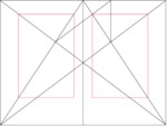
Exterior margins are traditionally wider than interior ones, and the bottom ones wider than the top ones, as seen in the “Canon de division harmonieuse” designed by the French architect Villard de Honnecourt in the 13th century and still a reference for modern typographers.37 (Figure 14.)
Figure 14
Click For Larger Image
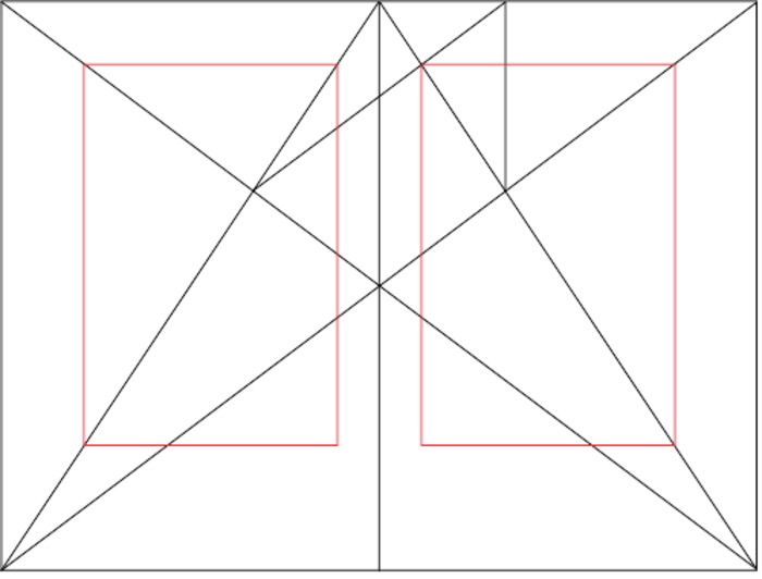
Canon de division harmonieuse designed by the French architect Villard de Honnecourt. Image courtesy of Jossi, Wikimedia Commons (https://commons.wikimedia.org/wiki/File:Van_de_Graaf_canon_in_book_design.svg).CLOSE or ESC
The importance given to the size of the page, its ratio, its margins, as well as typography and layout Layout a plan for the appearance of a piece of printed work. See: PDF Page CLOSE or ESC, attest to the importance of visual elements in reading. We must agree with Bonnie Mak that “the page is more than a simple vehicle or container for the transmission of ideas; it is a part of those ideas.”38 Modern psychology has confirmed the intuition held since antiquity by rhetoricians for whom cognition does not work in a purely abstract mode but is shaped by emotional responses to the way ideas are presented, either verbally or in writing. Moreover, recent research in neuroscience has shown that different circuits are responsible for the memory process: verbal data is memorised by the left side of the hippocampus while visual data uses the right side. Thanks to its spatial markers (recto, verso, top, bottom, unequal margins, indented paragraphs, dropped capitals, etc.), the page allows both mechanisms to be activated, facilitating a long-term memory of the information being read.39
Hypertext
The 20th century saw a tremendous rise in the quantity of books, magazines and journals available. This situation rapidly posed a problem of storage: in the last century, a librarian calculated that library space would have to double in capacity every 16 years in order to cope with the expansion of publications.40 Access was yet a bigger problem. In 1934, the Belgian librarian Paul Otlet imagined an electric telescope that would allow the user to read pages of books exposed in a special room of big libraries equipped with a “telephote.”41 A few years later, Vannevar Bush proposed to store on microfilm all published books and to develop mechanisms for establishing links between pages of information.42 For both systems, the page still had its “raison d’être” as the normal repository of a text.
With the advent of the computer, however, the text was cut from its visual embodiment. In a 1936 paper foreseeing the advent of the computer, Alan Turing decided that the tape, one of the three components of his Universal machine, did not need to be two-dimensional: “the two-dimensional character of paper is no essential of computation.”43 A few years later, Claude Shannon, who had met Turing while working as a cryptographer at Bell Labs, “abstracted the idea of the message from its physical details” and reduced text to a mere sequence of characters. “Noise” was a prominent component of his theory of information, covering “everything that corrupts the signal, predictably or unpredictably.”44 For a computer engineer, the visual components of the page were thus reduced to noise.
The computer was soon recognized as a powerful system for solving problems of storage and access to text. In 1960, Ted Nelson, who was then 23 years old, founded Project Xanadu, envisioning a vast computer network ushering in a new era of writing/reading. Building on Bush's seminal essay, Nelson was excited by the possibilities of computing machines and proposed the term “hypertext” for a mode of non-linear writing, with nodes giving the reader the possibility to choose the segment of text most interesting to her. This model is an extreme development of a tabular conception of text that allows the reader to explore a book without any set order, such as in a dictionary, a newspaper or a magazine. At about the same time, literary theorists such as Roland Barthes, Robert Jauss, Wolfgang Iser, and the reader-response critics were all demanding that more attention be given to the role of the reader.
Hypertext became a reality for the public with HyperCard, installed on the MacIntosh in 1987. A few years later, between 1989 and 1993, it became the universal system of information access with the advent of the World Wide Web. Hypertext started a real revolution and was soon recognized as “a politicized vision of reading that swung authority from the writer to the reader.”45 It is therefore not surprising that the term “page” was excluded from the discourse of hypertext theorists in that period. Instead, experts spoke of a “stack,” “card,” “node” or “paragraph” as the basic unit of textual content. Stuart Moulthrop used the term “space” while George Landow adopted the term “lexia” after Barthes, and Espen Aarseth proposed “texton.”46
In fact, the page has always been a field of conflicting dynamics opposing author and reader. While the former would like to link the latter to the continuous thread of his words, the reader also wishes to be in control: “In the struggle over the supremacy of the text, the writer and the reader decidedly wanted to be in control."47 As seen above, the manuscript and the book had partially satisfied the scholarly reader’s wishes by becoming more and more tabular. Hypertext goes well beyond that by acknowledging the reader’s right to surf at will on an ocean of data and chunks of information. If the page is of paramount importance for helping the reader take interest in a text and engage in continuous reading, it is much less important when the reader is just interested in decoding a specific message or finding a short answer to a question. We don’t need a “temple” dedicated to reading just for telephone numbers; a database will do better. The page with all its harmonious proportions and visual qualities is thus a device situated on the writer’s side and adapted to reading as a continuous or intensive activity.
The question of determining the optimal degree for segmenting a text into chunks remains, however, as does the importance of a visual display of text for helping the reader to memorize data. For newspapers and magazines, as well as scientific journals, the unity of text remains the most important principle, the hypertext links being mostly used to navigate easily between the table of contents and the text, or between the main text and footnotes.
The so-called “webpage” has only retained from the concept of the page the notion of unifying in a single space a collection of sentences possibly accompanied by multimedia. As one can see with Wikipedia, new norms govern the composition process. Paragraphs have more autonomy. Text is no longer conceived as a strict hierarchy but more as a network of interrelations.
Nevertheless, the relentless evolution of technologies is now giving back to the page some of the refinements previously reserved to the printing press. Instead of being displayed at the full width of the browser, text is now generally organized into a fixed-width column of 60 to 90 characters per line. This is the rule for most newspaper articles and scientific journals as well as works published in Wikisource. As already noted, a short line is more reader-friendly than a long one. Newspapers and most webpages have adopted a tabular layout Layout a plan for the appearance of a piece of printed work. See: PDF Page CLOSE or ESC, with a column of links generally set on the side of the main article, allowing readers to easily shift from one piece of text to another. The total width of the frame generally does not exceed 1000 pixels. In a browser open at full width on a standard screen of 1200x800, the remaining pixels are frequently used as margins on both sides of the frame. The hypertext page is thus now typically a tabular space not unlike the one offered by magazines or newspapers.
Before the advent of “wysiwyg” word processors (“What you see is what you get”) and LCD monitors, the page did not coexist well with the screen. Many people even predicted that the page would disappear. For engineers who developed the first protocols of data transmission, text had to be reduced to a pack of characters. Layout and typography were considered “frills.” Many members of the public were almost ready to “be convinced that all writing could be reduced to an assembly of black dots on a screen.”48
The PDF format, which appeared in 1993, was designed as a way to keep the physical space of the page. Instead of reading documents on the low-definition screens available at the time, most users chose to print every message and document of more than a few lines in length. Conceived as a digital avatar of the printed page, PDF offers the advantage of extreme portability, with possibilities for searches as well as comments and annotations. Moreover, a PDF page can be easily joined to others in order to form a book. Thanks to its reliability across platforms, PDF has been widely adopted by publishers for encoding the digital master of books sent to the printer.
In spite of that, the stability of this format, initially seen as an asset, may be perceived as a liability, particularly since the massive adoption of the smartphone (2007) and the touchscreen tablet (2010). Because PDF documents are created by default in US letter or A4 format (even though any format is possible), they may be difficult to read on small screens.
In recent years, however, PDF has become an open format and is now fully integrated with most browsers, making the opening of a document in this format quite as smooth and seamless as an HTML page.
The Kindle
Figure 15
Click For Larger Image
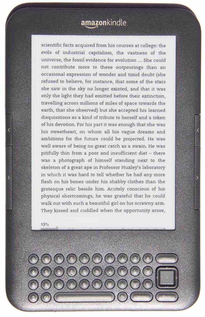
Amazon Kindle. Image courtesy of Christian Vandendorpe.CLOSE or ESC
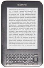
Hypertext has not made traditional books obsolete. Since the beginning of this century, various devices have been created in order to offer a specialized interface for continuous reading: Sony Reader, Kindle, Nook, Kobo, iLiad, iRex, etc. The most widely sold e-book reader is the Kindle (Figure 15). Launched in 2007 by Amazon, the Kindle has been designed to please avid readers and book lovers. Its e-paper screen allows reading without the annoying glare of backlit screens; the battery lasts for dozens of hours; there is room for hundreds of books; the typography is extremely readable, with margins like in a printed book; a status bar indicates the place reached in the book and the percentage of text already read. Last but not least, it is possible to highlight a passage, save comments on the owner’s personal webpage, bookmark a page, consult a dictionary for any word, and do a search in the book.
In spite of all these assets, the Kindle still lacked important features that are the norm in the codex. Until 2011, the page-number was replaced by a unit specific to Amazon, the “location,” which corresponded to a much smaller space than a normal page and encompassed only a few dozens of words. By clicking on the menu, the reader would see, for example, that she is at “location 1153 of 9349.” Readers of books are not used to such high numbers. Moreover, there is no clear correspondence between a given location and a physical space on the screen, contrary to the concept of the page. After many complaints, Amazon has finally decided to make available the “real” page number, but only for books sold after 2011 and also available in print.
Another complaint was that the Kindle page was not completely stable. After consulting the dictionary, a reader may discover that the page she was reading has shifted by a few lines. This is a real impediment to reading. According to Marc Changizi, the instability of the page in electronic media is one reason why readers find it more difficult to remember a text read on this support.49
The advent of ePub on tablets, smartphones and computers
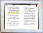
The iPad, launched by Apple in 2010, offered a very intuitive environment, notably because the menu is replaced by navigating with movements of the fingers on the screen. This is more akin to the way people read print and manipulate books, fostering an intimate relation with the device.
Figure 16
Click For Larger Image
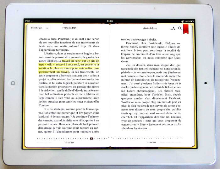
In ePub format the disposition of the text automatically adjusts to the window. Image courtesy of Christian Vandendorpe.CLOSE or ESC
The tablet comes with the app iBooks, which is able to display books formatted in the ePub format. This format became the official standard of the International Digital Publishing Forum in September 2007, replacing the former Open eBook standard. It was substantially improved with the advent in October 2011 of ePub 3.0, written in HTML5 and thus entirely compatible with the Web. This format is particularly useful for its fluidity that makes the text resizeable on any size of display or window, from a big monitor to a cellphone. It also offers the possibility of a fixed-layout and pre-paginated content, which is useful for mangas or illustrated books designed for large windows. There is also a possibility of resizing fonts, changing text and background colors, highlighting passages and bookmarking pages. In 2015, a tool for annotation became available in the browser with ePub.js.
In addition to having at the reader’s disposal the tools available on e-book readers, the tablet is able to display the book in double page format (Figure 16). When the iPad is rotated from portrait to landscape format, the ePub text, more flexible than the PDF, is automatically transformed from a single page to a double page of about 25 lines in height and 50 characters in width. A navigation bar at the bottom of the screen also allows a fast circulation through the book with just a movement of a finger.
The resilience of the page
The tablet and the e-book reader have thus ushered in a comeback of the page layout and prompted the appearance of various applications designed for making reading on mobile devices more convenient and enjoyable. Even on the Web, in a normal browser and without any special application, it is now possible to read books in the same way, by turning the page, as we do with normal books. The British Library was one of the first sites to offer this possibility with its “Turning the pages” system (see, for example, the original Alice in Wonderland).50 Open Library and archive.org followed suit and now offer thousands of books readable in that format.51
By creating a closed space, the page facilitates the engagement of a reader with a text. Its uniform layout is particularly helpful for a prolonged immersion in a narrative because it symbolically shuts out the external world. A stable layout of openings Opening facing pages of a book or other work with bound or folded pages. See: Centre Spread Page Spread CLOSE or ESC or paired pages is most efficient for summoning the activation of spatial memory52 and for a close study of long texts. Moreover, the book as a collection of pages offers the promise of a totality of meaning.
That being said, it is clear that the digital world offers new possibilities that go well beyond the page. Just as the printed world developed a variety of formats adapted to different types of content and of reading -- books, magazines, newspapers, comic books, flyers, posters, etc. -- so must the digital world develop formats best adapted to specific contents and readers’ needs: databases, maps, interactive charts, and multimedia.
Baudin, Fernand. L'Effet Gutenberg. Paris: Éditions du Cercle de la librairie, 1994.
Bringhurst, Robert. The Elements of Typographic Style, version 3.2. Vancouver: Hartley & Marks, 2008.
Bush, Vannevar. "As We May Think." The Atlantic Monthly 176.1 (1945): 101-108.
Demarcq, Jacques. "L'espace de la page. Entre vide et plein." In L'aventure des écritures: la page, edited by Anne Zali, 65-103. Paris: Bibliothèque Nationale de France, 1999.
Gleick, James. The Information: A History, a Theory, a Flood. New York: Random House, 2011.
Grafton, Anthony. The Footnote: A Curious History. Cambridge, MA: Harvard University Press, 1997.
Harris, Roy. La semiologie de l'écriture. Paris: CNRS, 1994.
Illich, Ivan. In the Vineyard of the Text: A Commentary to Hugh's Didascalicon. Chicago: University of Chicago Press, 1996.
Johnson, William A. Bookrolls and Scribes in Oxyrhynchus. Toronto: University of Toronto Press, 2004.
Mak, Bonnie. How the Page Matters. Toronto: University of Toronto Press, 2011.
Manguel, Alberto. "Turning the Page." In The Future of the Page. Andrew Taylor and Peter Stoicheff, eds. Toronto: University of Toronto Press, 2004. 27-36.
Ong, Walter. Orality and Literacy: The Technologizing of the Word. New York: Routledge, 1982.
Otlet, Paul. Traite de documentation: le livre sur le livre, theorie et pratique. Brussels: Mundaneum, 1934.
Parkes, Malcolm Beckwith. "The Influence of the Concepts of Ordinatio and Compilatio on the Development of the Book." In Medieval Learning and Literature: Essays Presented to Richard William Hunt, edited by J. J. G. Alexander and M. T. Gibson, 115-41. Oxford: Clarendon Press, 1976.
Pirenne, Henri. Mahomet et Charlemagne. Paris: Presses Universitaires de France, 1992.
Quignard, Pascal. Les Tablettes de buis d'Apronenia Avitia. Paris: Gallimard, 1984.
Rider, Fremont. The Scholar and the Future of the Research Library. New York: Hadham Press, 1944.
Sirat, Colette. "Du rouleau au codex." In Le livre au Moyen Age, edited by Jean Glenisson, 14-21. Paris: CNRS, 1988.
Stoicheff, Peter, and Andrew Taylor, eds. The Future of the Page. Toronto: University of Toronto Press, 2004.
Szalavitz, Maia. "Do E-Books Make It Harder to Remember What You Just Read?" Time, March 14, 2012. https://healthland.time.com/2012/03/14/do-e-books-impair-memory/.
Vandendorpe, Christian. "Reading on Screen: The New Media Sphere." In The Blackwell Companion to Digital Literary Studies, edited by Ray Siemens and Susan Schreibman, 203-15. Oxford: Blackwell Publishing, 2007.
Vandendorpe, Christian. From Papyrus to Hypertext. Toward the Universal Digital Library. Urbana and Chicago: University of Illinois Press, 2009.
Vandendorpe, Christian. "The Fate of the Novel in an Era of Ergative Reading." In Lire demain: des manuscrits antiques a l'ere digitale, edited by Claire Clivaz, Jerome Meizoz, Francois Vallotton, Joseph Verheyden, and Benjamin Bertho, 73-88. Lausanne: Presses Polytechniques et Universitaires Romandes, 2012.
Vasquez, Karelia. "La memoria del lector." El Pais semanal no 1860 (20 May 2012). Accessed May 25, 2013, at http://cultura.elpais.com/cultura/2012/05/17/actualidad/1337267542_314625.html.
Zali, Anne. L'aventure des écritures: la page. Paris: Bibliothèque nationale de France, 1999.
 Supported by the University of Saskatchewan Humanities and Fine Arts Digital Research Centre. Initially created with the support of the Social Sciences and Humanities Research Council of Canada. Licensed under a Creative Commons Attribution-Noncommercial-No Derivative Works 3.0 License